Who we serve
Annuity Agent Website and Funnel Design That Books Appointments
Annuity agent website and funnel design is a sequence, not a brochure: a fast, trust-heavy site that moves a 55-to-70-year-old prospect from 'what is an annuity' to a booked income-review call. Each page carries one clear conversion goal, an offer the buyer actually wants, and proof that you handle suitability seriously.
Free · 15-minute teardown · no pitch deck
- We run our own final-expense book
- No pitch deck — we screen-share real numbers
- TCPA-aware · CMS/AEP-compliant · Meta Special Ad Category
- Core Web Vitals < 2.0s LCP
A digital business card is not a funnel. A headshot, a carrier logo wall and a phone number will not convert a $50-CPC click, because a retirement-income buyer does not decide on the first visit. Annuity agent website and funnel design has to carry that prospect across several steps, each with one job, until a review call is on your calendar.
We are a marketing operation, not a lead vendor. The conversion systems and ad discipline below are the same ones we run for our senior-market clients, where we operate our own final-expense and senior-market lead book. Annuity is a different product with different math, but the funnel mechanics transfer cleanly.
This page works through what the funnel actually is, who lands on it, the page set, what the intake form has to collect under a best-interest standard, what the copy and the proof section may claim, how the page has to read for a 55-to-70-year-old, how fast it has to load in published numbers, what goes behind the form, and what the two ways of buying a site cost.
What “annuity agent website and funnel design” actually means
A website is where people land. A funnel is the path that turns a landing into a booked appointment. The two overlap, but the funnel is the part that makes you money. It is the offer, the form, the follow-up, and the calendar working as one sequence.
The mistake we look for first is asking for a sale too early. A 58-year-old comparing a fixed indexed annuity is researching, not buying. Your funnel’s job on day one is to trade education for contact details, then nurture until they are ready to talk.
Two architectural decisions come before any design work, and both are cheaper to make now than to retrofit. The first is whether campaign landing pages live on your main domain or on a separate path — one domain keeps your authority and your analytics in one place, and it means the compliance review covers everything at once. The second is whether the site is a marketing asset that hands qualified people to you, or an attempt to do the whole sale online. For annuity, it is the first. The product is deliberated, often with a spouse in the room, and the conversion event you are engineering is a conversation, not a checkout.
Who actually lands on the page, and what they are asking
Write the homepage for the wrong visitor and everything downstream misfires. The visitor is not a first-time saver asking what an annuity is. The visitor this page is built for is a non-retiree in the last stretch of accumulation, and the question they arrived with is whether they are going to be all right.
The Federal Reserve’s Survey of Household Economics and Decisionmaking puts a number on that question. In the Report on the Economic Well-Being of U.S. Households in 2025, published May 2026, 35 percent of non-retirees overall said their retirement savings plan was on track. Broken out by age in table 29, the share was 22 percent for ages 18 to 29, 35 percent for ages 30 to 44, 43 percent for ages 45 to 59, and 53 percent for ages 60 and older.
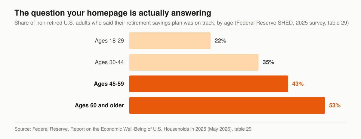
Non-retirees who said their retirement savings plan was on track, by age. Source: Federal Reserve, Report on the Economic Well-Being of U.S. Households in 2025 (May 2026), table 29.
Two design consequences follow directly. First, the headline that matches the visitor is a question about their plan, not a definition of a product category. Second, a page that opens with product mechanics is answering a question the visitor has not asked yet, which is why education pages that lead with “what is a fixed indexed annuity” tend to be read and abandoned rather than read and acted on.
The same report’s table 28 describes what that visitor already owns. Among adults aged 55 to 64: 73 percent had a tax-preferred retirement account such as a 401(k) or IRA, 82 percent owned a home, 67 percent had a savings or money market account or a certificate of deposit, 45 percent held stocks, bonds, ETFs or mutual funds outside a retirement account, and 39 percent had a defined benefit pension through an employer. Three of those — the retirement account, the CD, and the pension decision — are the pools an income review is usually about, and each deserves its own page rather than a paragraph on a general one.
On the product side, LIMRA’s final full-year figures, released March 23, 2026, put total U.S. annuity sales at $464.1 billion in 2025. Within that: fixed-rate deferred at $165.3 billion, fixed indexed at $127.9 billion, registered index-linked at $79.5 billion, traditional variable at $63.1 billion, single premium immediate at $14.4 billion, and deferred income at $4.8 billion. Build the product pages for the lines you are actually contracted and licensed to write, and name them the way a buyer searches — “MYGA rates,” “fixed indexed annuity,” “income annuity” — rather than the way a carrier brochure names them. The channel-level strategy that feeds those pages sits in annuity lead generation.
The page-by-page funnel structure we build
This table is the page set we build for an independent annuity producer, with the single job and the conversion event each page owns.
| Page | One job | Primary conversion |
|---|---|---|
| Homepage | Frame retirement income, build trust | Route to review-call offer |
| Annuity education page | Answer “is this right for me?” | Capture email for a guide |
| Product page per line (FIA, MYGA, SPIA) | Match the term the buyer searched | Capture or book |
| About / credentials | Prove licensing and experience | Reinforce, push to booking |
| Landing page (paid traffic) | Match one ad promise exactly | Book or opt in |
| Calendar / booking page | Remove friction from scheduling | Confirmed appointment |
| Privacy and consent | Say what happens to the data | Trust, not conversion |
Each page links forward to the next step and never dead-ends. A prospect should always have an obvious “next click.”
One job per page is the rule that governs the whole set. An education page that carries a newsletter signup, a phone number, a blog sidebar and a booking button is asking the visitor to make four decisions, and none of them is the outcome we design against. Give each page one primary action, one secondary action at most, and let the internal links carry everything else. The paid-traffic version of that discipline is our insurance landing page service; the sequence logic behind the whole set is our insurance sales funnel service.
What the intake form has to collect, because the recommendation is a best-interest sale
Here is where an annuity site differs from every other line an agent might build for. What happens after the form is governed by a best-interest standard, and that reaches back into the form itself.
The NAIC’s Suitability in Annuity Transactions Model Regulation (#275) was revised in February 2020 so that recommendations by agents and insurers must be in the best interest of the consumer, and so that agents and carriers may not place their financial interest ahead of the consumer’s. The NAIC’s own summary of the model says it “requires agents and carriers to act with ‘reasonable diligence, care and skill’ in making recommendations.” As of that page’s November 1, 2023 update, the NAIC stated that 40 states had adopted the model revisions.
States adopt it in their own words. Texas, for example, codified it as Insurance Code Chapter 1115, Suitability of Certain Annuity Transactions. Section 1115.002 defines “Consumer profile information” as “information that is reasonably appropriate to determine whether a recommendation addresses the consumer’s financial situation, insurance needs, and financial objectives,” and then enumerates fourteen items. Section 1115.0513, the Care Obligation, requires an agent making a recommendation to “exercise reasonable diligence, care, and skill” to, among other duties, “obtain consumer profile information from the consumer before making the recommendation of an annuity” and to “communicate the basis of the recommendation.”
That has a concrete effect on the build. A web form is not the place to collect all fourteen items — asking a stranger for their liquid net worth before they have spoken to you is how you get an abandoned form. But the funnel as a whole has to produce them, in order, and the site should be designed as the first stage of that collection rather than as a name-and-phone capture bolted onto a brochure.
This table maps the fourteen items Sec. 1115.002 lists to the stage of the funnel where each one is reasonable to ask for.
| Consumer profile item | Web form | Qualifying call | Suitability form at application |
|---|---|---|---|
| (A) age | Age band, optional | Confirmed | Exact |
| (B) annual income | No | Range | Exact |
| (C) existing assets and financial products | No | Type and rough size | Itemized |
| (D) financial situation and needs, including debts | No | Discussed | Documented |
| (E) financial experience | No | Discussed | Documented |
| (F) financial objectives | One-line “what prompted this” | Explored | Documented |
| (G) financial resources used to fund the annuity | No | Rollover, CD, pension | Documented |
| (H) financial time horizon | Optional “when do you need income” | Confirmed | Documented |
| (I) insurance needs | No | Discussed | Documented |
| (J) intended use of the annuity | Optional | Confirmed | Documented |
| (K) liquid net worth | No | Range | Exact |
| (L) liquidity needs | No | Discussed | Documented |
| (M) risk tolerance | No | Discussed | Documented |
| (N) tax status | No | Discussed | Documented |
Read the left column as a design brief for restraint. Three or four fields on the public form, chosen because they qualify and route — not because a compliance form will eventually need them. Everything else belongs to the conversation, and the conversation is what the funnel exists to book. The screening layer that runs between the form and your calendar is annuity appointment setting.
What the site can say about an annuity, and what it cannot
None of what follows is legal advice, and your state’s insurance advertising rules and your carrier’s or IMO’s advertising review sit on top of it. But two patterns get annuity websites into trouble often enough to design against by default: describing a return as guaranteed when the contract does not guarantee it, and describing a product’s index behaviour as upside without downside without the caps, spreads, participation rates and surrender charges that condition it.
The safe version is not vaguer. It is more specific. “Learn how a fixed indexed annuity credits interest, and what the cap and participation rate do to that number” is a stronger headline than “market upside with no market risk,” and it survives a compliance read.
This table pairs the framing that draws complaints with the framing we write instead, element by element.
| Element | Risky framing | What we write |
|---|---|---|
| Return language | “Guaranteed 8% returns” | “How the contract’s guaranteed minimum works, and what is not guaranteed” |
| Index products | “Market upside, no downside” | “Interest credited on an index, subject to a cap, spread or participation rate” |
| Comparison | “Better than a CD” | “How a MYGA and a CD differ on term, taxes, liquidity and guarantee” |
| Rates | “Best annuity rates” | A dated rate table with the carrier, term and conditions named |
| Identity | Vague “retirement planner” | Licensed insurance producer, states, NPN, what you do and do not sell |
| Urgency | “Rates end Friday” with no basis | A real, dated carrier rate change, or no urgency at all |
| Fees | Silent | Surrender period and charges described on the product page |
The identity row does more work than it looks. A page that states plainly what you are licensed to sell, and what you are not, converts the specific visitor better than a page that implies you do everything — and it is the same sentence that keeps a regulator’s read uneventful.
Testimonials, reviews and the proof section
The trust block is where agents reach for social proof, and it is the part of an annuity site with the clearest federal rules. The FTC’s Guides Concerning Use of Endorsements and Testimonials in Advertising, 16 CFR part 255, state at § 255.0(a) that the Guides “address the application of section 5 of the FTC Act, 15 U.S.C. 45, to the use of endorsements and testimonials in advertising.”
Five paragraphs land on a website’s proof section.
§ 255.0(b) defines the term broadly: an “endorsement” means “any advertising, marketing, or promotional message for a product that consumers are likely to believe reflects the opinions, beliefs, findings, or experiences of a party other than the sponsoring advertiser, even if the views expressed by that party are identical to those of the sponsoring advertiser.” The paragraph goes on to say that “Verbal statements, tags in social media posts, demonstrations, depictions of the name, signature, likeness or other identifying personal characteristics of an individual, and the name or seal of an organization can be endorsements.” A carrier logo wall sits closer to that last clause than it looks.
§ 255.1(a) sets the baseline: “Endorsements must reflect the honest opinions, findings, beliefs, or experience of the endorser. Furthermore, an endorsement may not convey any express or implied representation that would be deceptive if made directly by the advertiser.”
§ 255.1(b) governs how you print one. An advertisement “need not present an endorser’s message in the exact words of the endorser unless the advertisement represents that it is presenting the endorser’s exact words, such as through the use of quotation marks. However, the endorsement may not be presented out of context or reworded so as to distort in any way the endorser’s opinion or experience with the product.” In practice: if it is inside quotation marks on your site, it is character-exact, including the parts that are less flattering than the trimmed version.
§ 255.2 covers consumer testimonials, which is what an agent site mostly carries. Paragraph (a) requires the advertiser to “possess and rely upon adequate substantiation, including, when appropriate, competent and reliable scientific evidence, to support express and implied claims made through endorsements in the same manner the advertiser would be required to do if it had made the representation directly,” and adds: “Consumer endorsements themselves are not competent and reliable scientific evidence.” Paragraph (b) is the one that reaches a “my client got X” story: an endorsement relating one consumer’s experience on a central or key attribute “will likely be interpreted as representing that the endorser’s experience is representative of what consumers will generally achieve with the advertised product in actual, albeit variable, conditions of use,” and absent substantiation for that, the ad “should clearly and conspicuously disclose the generally expected performance in the depicted circumstances.” Paragraph (d) reaches review handling: advertisers “should not take actions that have the effect of distorting or otherwise misrepresenting what consumers think of their products.”
§ 255.5(a) covers connections. Where a connection between the endorser and the seller “might materially affect the weight or credibility of the endorsement, and that connection is not reasonably expected by the audience, such connection must be disclosed clearly and conspicuously.”
The build consequence is simple and slightly unwelcome: if you do not have documented, permissioned client statements yet, the proof block is not testimonials. It is licensing, states, years in practice, carrier appointments, the process you follow, and the documents you hand over. Those are checkable, and a checkable trust block outperforms a set of unattributed quotes with a stock photo attached.
Designing for a 55-to-70-year-old reader
Legibility is a conversion feature on this site, not a nicety, and the standard is published rather than a matter of taste. WCAG 2.2 sets the relevant criteria.
Success criterion 1.4.3 Contrast (Minimum), level AA, requires that “The visual presentation of text and images of text has a contrast ratio of at least 4.5:1,” with large-scale text and images of large-scale text allowed a ratio of at least 3:1, and exceptions for incidental text and logotypes. Criterion 1.4.4 Resize Text, level AA, requires that “Except for captions and images of text, text can be resized without assistive technology up to 200 percent without loss of content or functionality” — which is the criterion a fixed-height hero with an absolutely positioned headline usually fails. Criterion 2.5.8 Target Size (Minimum), level AA, requires that “The size of the target for pointer inputs is at least 24 by 24 CSS pixels,” subject to spacing, equivalent-control and inline exceptions. And criterion 3.3.2 Labels or Instructions, level A, requires simply that “Labels or instructions are provided when content requires user input” — the reason a placeholder-only form is a defect, since the label vanishes the moment the visitor starts typing.
These are the same failures the web at large is making. WebAIM’s 2026 report on the top 1,000,000 home pages, run in February 2026, found an average of 56.1 detected errors per home page, and six failure types accounting for 96 percent of all detected errors: low contrast text on 83.9 percent of home pages, missing image alternative text on 53.1 percent, missing form input labels on 51 percent, empty links on 46.3 percent, empty buttons on 30.6 percent, and missing document language on 13.5 percent.
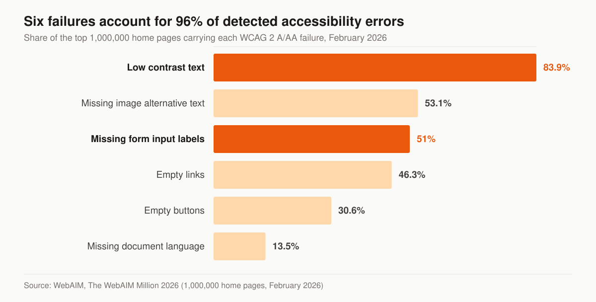
Detected WCAG 2 A/AA failures across the top one million home pages. Source: WebAIM, The WebAIM Million 2026.
Look at the second and third bars in order. Missing form input labels sits at 51 percent — on a site whose entire commercial purpose is a form. Low contrast text sits at 83.9 percent, and grey-on-white body copy at 15px is exactly the aesthetic an agency template reaches for. Both are cheap to fix at build time and awkward to fix afterwards, because they are decisions in the type scale and the palette rather than bugs in a component.
How fast the page has to load, in published numbers
“Fast” is not a design opinion; Google publishes the thresholds. Largest Contentful Paint, the loading metric, “should occur within 2.5 seconds of when the page first starts loading.” Interaction to Next Paint, the responsiveness metric, should be 200 milliseconds or less. Cumulative Layout Shift, the visual-stability metric, should be 0.1 or less. Each is assessed at the 75th percentile of page loads, segmented across mobile and desktop devices.
On an annuity site the usual offenders are predictable. A hero image shipped at desktop resolution to phones. A chat widget, a calendar embed and three tracking scripts loading ahead of the form. A booking iframe that reflows the page when it finally paints, which is a layout-shift problem you measure in dropped bookings rather than in milliseconds. We build to the thresholds and hand over the field measurement rather than a lab screenshot. The same standard runs through our insurance web design service, and it is half of what makes a page rankable at all — the other half is in our guide to ranking an insurance agency website.
What makes an annuity funnel convert
- One offer per page. A free income review or a downloadable annuity guide beats “Contact us.” Specificity wins.
- Speed and clarity. Older buyers abandon slow, cluttered pages. Large type, fast load, short forms.
- Trust before ask. Licensing, years in practice, and a plain statement that every recommendation is suitability-checked. This is your E-E-A-T signal for both humans and AI search.
- Compliant copy. Stay factual. Avoid guaranteed-return language and “get rich” framing. Describe how products work, not what they will “definitely” return.
- Follow-up built in. Appointments often land on a later touch rather than the first. The funnel must hand contacts to a CRM and email sequence, not a spreadsheet.
- A page per trigger, not per product only. Someone searching a rollover, an RMD and a maturing CD are three different visitors with three different first sentences, even when the product recommendation converges.
- The couple, not the individual. Where a spouse is part of the decision, a booking flow that asks whether both will attend is doing suitability work and show-rate work at the same time.
The offer: what goes behind the form
An offer is what the visitor trades an email address for, and “sign up for our newsletter” is not one. Three work on this buyer.
The income review is the one we lead with, because it names the conversation the visitor already wants: a look at what the money in motion could produce as income, and what it costs. It is also the offer the rest of the funnel is engineered around, so make it the primary action on most pages.
A rate or comparison document works for the visitor who arrived on a MYGA or rate query. It has to be dated, carrier-named and honest about conditions, which means it needs an owner and a refresh cadence rather than a one-time PDF.
An education guide works for the earlier visitor. Worth knowing before you commission one: the NAIC publishes a Buyer’s Guide for Deferred Annuities and a Buyer’s Guide to Fixed Deferred Annuities as free downloads. They are neutral, plainly written, and your prospect can get them without you — which is exactly why they should not be your only lead magnet. Offer the NAIC guide as a genuine service, and put your own work beside it: the questions you ask on a review, the way you compare two contracts, the things you tell people not to buy.
Whatever the offer is, the page has to say what happens next. “We will email the guide and call within one business day to see if a review makes sense” sets an expectation you can then keep, and a kept expectation is the first proof point the prospect has of how you work.
Booking and follow-up: the last two steps of the funnel
A funnel that ends at the form is not finished. Two mechanics decide whether an opt-in becomes a kept appointment.
Booking. Put a real calendar on the site with genuine availability, offer phone and video as well as in-person, and confirm immediately in writing. Each extra step between “I want to talk” and a confirmed slot is a place to lose people, and losses here are the ones you already paid for.
Follow-up. The contact record has to land in a CRM the moment the form submits, and a sequence has to run whether or not you remember. This is the part we check first — not the top, where the traffic is measurable, but three weeks in, where a slow decider quietly goes cold. Our insurance email and SMS automation service runs that cadence, and if you are still choosing the system underneath it, our comparison of CRMs for insurance agents covers the options.
What a build costs, and what a template subscription costs
Two products share the name “insurance agent website,” and comparing their prices without naming the difference is how agents end up disappointed by both.
A platform subscription licenses a template with insurance content in it, hosted and maintained by the vendor. Prices are published: BrightFire lists Insurance Agency Websites at $170 per month, alongside Local Listings Management at $50, Social Media Marketing at $100, Reviews & Reputation Management at $110, Search Engine Marketing at $160 and an Ultimate SEO Bundle at $290 per month.
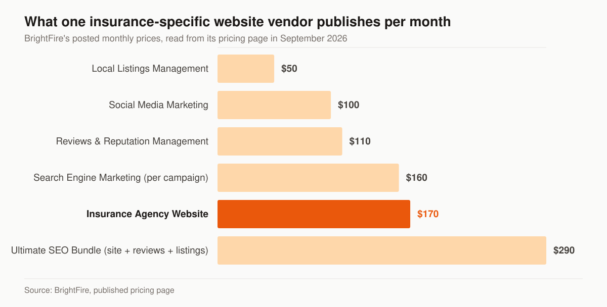
Published monthly prices from one insurance-specific website vendor. Source: BrightFire, pricing page.
A built site is a project: your architecture, your copy, your intake design, your performance budget, and code you own.
This table sets the two purchases against each other on the terms that decide which one you want.
| Platform subscription | Built site | |
|---|---|---|
| Published example | BrightFire Insurance Agency Websites, $170/mo | Our one-time build, $2,500–$8,000 |
| What you get | A template with insurance content, hosted | Architecture, copy and code specific to your book |
| Product pages | The vendor’s set | One per line you are contracted to write |
| Intake design | Whatever the vendor’s form collects | Fields chosen against the consumer-profile items you need |
| Accessibility | The template’s | Built against the WCAG 2.2 AA criteria above |
| Performance | Shared across the vendor’s customers | Built and measured against the Core Web Vitals thresholds |
| Ownership | Ends when the subscription ends | Yours |
| Ongoing traffic work | Bought per product | Foundation $2,500/mo, Growth $3,500/mo, Full-Funnel $5,500/mo |
The honest version: if you need a presence and a phone number, a subscription template is a reasonable purchase and the published price is the price. If the site is meant to convert paid clicks on a six-figure product and start a suitability record, it is a build. Our tiers and what each includes are on the pricing page — published, month to month, ad spend billed at cost.
How we build one
The sequence matters more than the tooling, and it starts with scope rather than design.
- Name the lines and the states. Which products you are contracted for and where you are licensed decides the page set, the disclosures and the rate content. It is also the answer that stops a site from implying you sell things you do not.
- Write the page set before the design. Real copy with nouns and numbers. Design decisions made against real copy survive; decisions made against placeholder text get redone.
- Design the intake against the profile items. Three or four public fields, chosen to qualify and route, with the rest sequenced into the call and the application.
- Set the type scale and palette against WCAG 2.2 AA first. Contrast, 200 percent resize, 24-by-24 targets and real labels are cheaper as constraints than as fixes.
- Set a performance budget, then build to it. LCP under 2.5s, INP under 200ms, CLS under 0.1, measured on a mid-range phone at the 75th percentile.
- Wire booking and CRM handoff before launch. A calendar with real availability, an immediate confirmation, and a sequence that runs without you.
- Instrument the four numbers below, then launch. Analytics added after the fact never reconstructs the first month.
Steps one and three are where a build goes wrong quietly. Everything after them is craft.
What to measure once it is live
An analytics install left on its defaults reports vanity metrics. We instrument four things and largely ignore the rest.
Form starts versus completions, because the gap between them is a form problem you can fix this week rather than a traffic problem you cannot. Booked appointments by source page, because it tells you which pages earn their place and which are decoration. Kept appointments, because a booking that no-shows is a reminder-cadence problem, not a marketing one, and the two have completely different fixes. And field-measured Core Web Vitals on mobile at the 75th percentile, because the lab score on your laptop is not the number that describes your visitors.
Notice what is missing: sessions, bounce rate and time on page. None of them tell you whether a 62-year-old with a rollover in motion got onto your calendar. AI assistants are becoming a route to the same pages, which is a separate measurement question — our AI-search visibility work and our guide to AI search for annuity agents cover it.
Where this fits in your wider marketing
The funnel is the conversion engine; the rest of your marketing feeds it. Pair this build with the strategy in our annuity agent marketing pillar, and lean on our core insurance web design service for the technical build and CRO. If you are running paid traffic to fill it, our insurance PPC management handles the ad side, annuity Facebook ads covers the paid-social version, and our AI-search and GEO work gets your education pages cited when prospects ask ChatGPT or Google’s AI about annuity options. For the wider client-acquisition picture, see how to get annuity clients with marketing, and for what a finished agent site looks like across lines, our insurance agent website examples.
A note on lead sourcing: this page is about generating your own appointments. If you also want to buy annuity leads or live transfers as a product to fill gaps, that is a separate game handled by our sister brand. You can buy leads direct from getinsureleads for that. We build the owned funnel; they sell the inventory.
Start with a funnel audit, not a redesign
Before you rebuild anything, find out where the current site leaks. Are people landing and bouncing? Opting in but never booking? Booking but not showing? Each leak has a different fix, and guessing wastes ad budget. Get a free marketing audit and we will map your funnel step by step, then show you the two or three changes that move the most appointments for the least work. If you would rather talk it through first, contact us; if you want to see the standard applied across silos, the services overview lays out how the pieces connect.
The services behind it