Who we serve
Final Expense Agent Website Design That Turns Visitors Into Booked Appointments
Final expense agent website design is the practice of building a fast, trust-heavy site that converts seniors and their families into booked calls. It needs sub-2.5-second load, plain language, visible licensing, and one clear lead-capture path. Everything else is decoration.
Free · 15-minute teardown · no pitch deck
- We run our own final-expense book
- No pitch deck — we screen-share real numbers
- TCPA-aware · CMS/AEP-compliant · Meta Special Ad Category
- Core Web Vitals < 2.0s LCP
Plenty of final expense agents have a sound offer and a website that quietly wastes it: slow to load, written for nobody in particular, phone number buried three taps down. Final expense agent website design is a conversion problem first and a visual problem second.
We run our own final-expense lead book, so the site sitting behind those leads is judged the way an operator judges it — it’s either doing real work or quietly wasting the spend.
What a final expense website has to do
It has one job: turn a stranger who is thinking about burial costs into a booked call. Pretty does not do that. Fast, clear, and trustworthy does.
The buyer is usually a senior or an adult child handling a parent’s affairs. They are cautious, often on a phone, frequently on a slow connection. Design for that person, not for your designer.
That framing decides everything downstream. A site built to impress other agents gets a carousel, a stock hero, and a mission statement. A site built for a 72-year-old comparing two agents gets a phone number, a face, a licence, and a form with three fields. The second one is harder to sell to the agent paying for it and easier for the buyer to act on.
Who is actually reading the page
Design decisions get easier once you stop guessing at the audience. Pew Research Center’s Mobile Fact Sheet, from a survey of U.S. adults conducted February 5 to June 18, 2025, reports that 95% of adults 65 and older own a cellphone of some kind, while 78% own a smartphone. In the 50-to-64 band it is 98% and 90%.
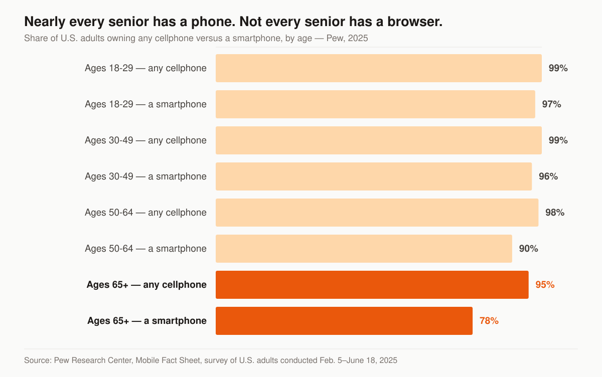
Cellphone versus smartphone ownership by age. Source: Pew Research Center, Mobile Fact Sheet, survey of U.S. adults conducted Feb. 5–June 18, 2025.
Two design consequences fall straight out of those two bars. First, the two numbers in the 65-plus band are not the same number, and the people in that difference can take a call but have no comfortable way to fill in a web form on the phone they own — which is why the phone number is a conversion element, not a footer detail. Second, the smartphone number is high enough that a desktop-first layout is the wrong default; the mobile view is the real site and the desktop view is the variant.
The third reader is the adult child. They are 45, they are on a laptop at work, and they are vetting you on behalf of a parent who will never open a browser. That visitor wants your licence, your states, your carriers, and a way to book a call for someone else. If the whole page is written in the second person to the insured, you have made that visitor do translation work at the exact moment you wanted them to act. Our final expense marketing hub covers how the same split shows up in ad targeting and phone scripts.
Speed is the first trust signal
A site that stalls reads as “small operation, maybe not real.” Google’s Core Web Vitals give you the targets to hit, measured at the 75th percentile of page loads and segmented across mobile and desktop.
Table: the three Core Web Vitals thresholds Google publishes, and what each one costs you on a final expense site.
| Metric | Threshold | Why it matters for FE buyers |
|---|---|---|
| Largest Contentful Paint | under 2.5s | Older phones, cellular data — slow = abandoned |
| Interaction to Next Paint | under 200ms | Tapping a button that lags kills confidence |
| Cumulative Layout Shift | under 0.1 | Content jumping makes the form feel broken |
Hitting all three at once is the part people underestimate. The HTTP Archive’s 2024 Web Almanac reports that 43% of websites had good Core Web Vitals with INP on mobile that year, with 59% of mobile pages achieving a good LCP score, 74% of mobile websites recording good INP, and 79% scoring good on CLS.
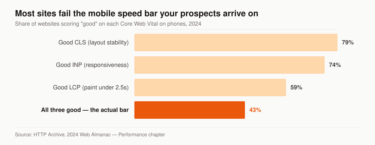
Share of websites scoring “good” on each Core Web Vital on mobile, 2024. Source: HTTP Archive, 2024 Web Almanac — Performance chapter.
Where does the time go? The same Web Almanac’s page weight chapter puts the median mobile home page at 2,311 KB, of which images are 900 KB and JavaScript 558 KB, against 111 KB of fonts, 73 KB of CSS and 18 KB of HTML. The top two rows are also the two an agent site controls directly: an uncompressed hero photograph, and a page builder loading a library for effects nobody scrolls far enough to see.
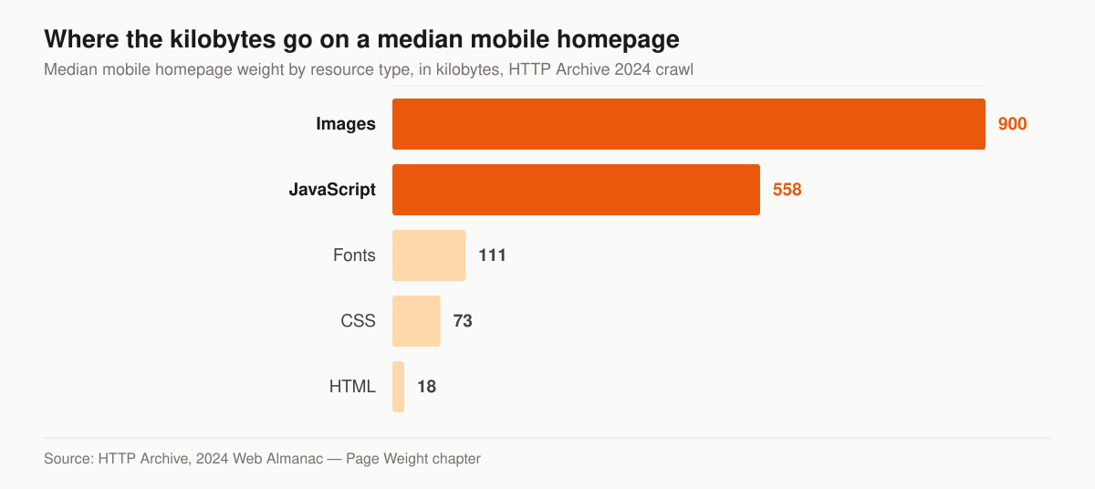
Median mobile home page weight by resource type. Source: HTTP Archive, 2024 Web Almanac — Page Weight chapter.
Fixing it is mechanical, not creative — and it is a cheap conversion lift. Compress and resize images to the dimensions they actually render at, serve modern formats, drop the slider plugin, set explicit width and height on every image so nothing reflows, and stop loading four typeface weights when the page uses two. Our insurance web design service treats page speed as line one of the spec, and the rank-an-agency-website walkthrough covers how the same work feeds organic visibility.
Design for age-related vision, not for your monitor
Contrast is the accessibility failure we fix first on a site read by people with age-related vision change, because it is measurable rather than a matter of taste. WCAG 2.2 Success Criterion 1.4.3, Contrast (Minimum), is a Level AA criterion requiring that “The visual presentation of text and images of text has a contrast ratio of at least 4.5:1”, with a 3:1 allowance for large-scale text and stated exceptions for incidental text and logotypes.
The default state of the web fails that bar. WebAIM’s 2026 study of the top one million home pages found that “95.9% of home pages had detected WCAG 2 failures”, averaging 56.1 errors per page, and that six failure types account for 96% of everything detected.
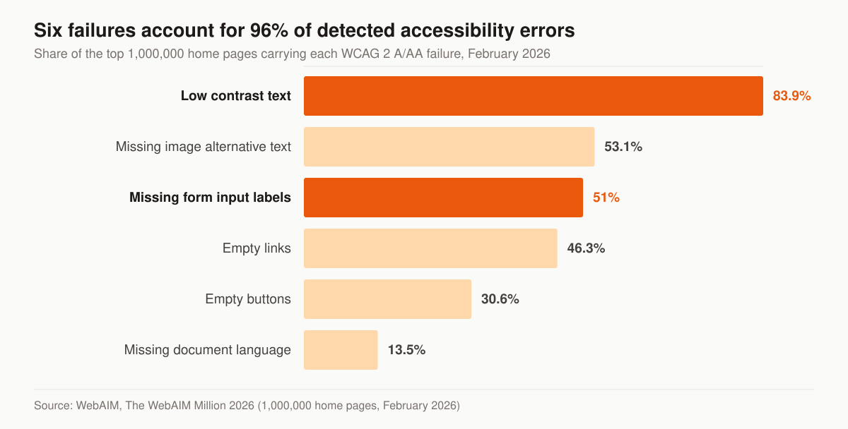
Share of the top 1,000,000 home pages carrying each WCAG 2 A/AA failure. Source: WebAIM, The WebAIM Million 2026, February 2026 sample.
Three of those six sit directly on a final expense conversion path. Low contrast text appeared on 83.9% of pages, and WebAIM counted an average of 34 distinct instances per home page — on a site read by people with age-related vision change, that is the difference between reading your licensing line and skipping it. Missing form input labels appeared on 51% of pages, and WebAIM reports that one third, 33.1%, of form inputs were not properly labelled; an unlabelled date-of-birth field is a dead end for anyone using a screen reader and a guessing game for everyone else. Missing alternative text appeared on 53.1% of pages, which also strips meaning from the images an AI engine is trying to read.
The practical version for an agent site is short. Body text at 18px or larger with real line spacing. Dark text on a light background, tested against the 4.5:1 ratio rather than eyeballed. Visible labels above every field, not placeholder text that vanishes the moment someone starts typing. Tap targets large enough to hit with an unsteady hand. Buttons that say what happens next in words, not an arrow icon. None of this costs anything at build time and all of it is expensive to retrofit.
Trust, made visible
Seniors and their families buy from someone who looks accountable. Put it on the page:
- Your name, photo, and the states you are licensed in
- A plain statement that you are a licensed agent (compliance reads as competence, not boilerplate)
- Carrier logos you actually represent
- Real reviews with first name and city — not stock five-star clip art
- A physical or local presence cue, even if you work from home
Skip the stock photo of a smiling couple in a field. It signals “template,” and templates do not earn a phone call.
Two additions earn their space on a final expense site specifically. The first is a short, honest explanation of what the product does and does not do — guaranteed-issue policies carry a waiting period and graded policies pay a reduced benefit for a stated period, and a page that explains that before the call removes an objection that otherwise surfaces mid-appointment. Our burial insurance page goes deeper on the product language families search for. The second is a named human with a way to reach them. We treat asking for a review as a scheduled step rather than an occasional favour, which is what our reputation and reviews service exists to run.
Lead capture: one path, repeated
The page should ask for one action, and ask for it more than once. Pick a primary path and commit:
- A short form — name, ZIP, date of birth is plenty to quote final expense
- A tap-to-call button with a real number, visible without scrolling on mobile
- A clear, single headline that names the outcome (“Burial coverage that pays the funeral home directly, no medical exam”) — verify any product claim or price you publish against the carrier’s own material
Every extra form field costs you completions. If you do not need it to quote, cut it. And make sure your follow-up is ready before you turn on traffic — speed-to-lead beats clever copy. See our lead follow-up cadence playbook for the timing that actually books appointments.
Two mechanics matter more than the form’s design. The first is where the submission goes: an email notification to an inbox you check twice a day is not a lead system, and the gap between submission and first dial is where the lead cools. The second is what happens after submit — a real confirmation page, not an inline “thanks” that leaves the visitor unsure whether anything happened, and one that tells them who is calling, from what number, and roughly when. That page is also the only reliable place to fire a conversion event, which the measurement section below depends on.
What the consent line under your form has to say
This is not legal advice and your own counsel should review your form, but the federal text is public and worth reading before a developer writes a checkbox. Under 47 CFR 64.1200(f)(9), the term prior express written consent means “an agreement, in writing, bearing the signature of the person called that clearly authorizes the seller to deliver or cause to be delivered to the person called advertisements or telemarketing messages using an automatic telephone dialing system or an artificial or prerecorded voice, and the telephone number to which the signatory authorizes such advertisements or telemarketing messages to be delivered.”
Read the scope of that sentence carefully. It defines consent for calls placed with an automatic telephone dialing system or an artificial or prerecorded voice — a manually dialled call is a different question with a different analysis. The same paragraph requires the written agreement to include “a clear and conspicuous disclosure” telling the signer that executing it authorizes those calls, and that “The person is not required to sign the agreement (directly or indirectly), or agree to enter into such an agreement as a condition of purchasing any property, goods, or services.” Subparagraph (ii) confirms that “signature” includes an electronic or digital form of signature to the extent it is recognized as valid under applicable federal law or state contract law, which is what makes a web form workable at all.
Separately, 64.1200(c) states that no person or entity shall initiate any telephone solicitation to a residential telephone subscriber who has registered on the national do-not-call registry, and that “Such do-not-call registrations must be honored indefinitely, or until the registration is cancelled by the consumer or the telephone number is removed by the database administrator.” A web form is one of the ways an agent establishes the permission that changes that analysis, which is exactly why the form’s record-keeping matters as much as its wording.
Table: what the form should capture so the consent is evidence rather than decoration.
| What to store | Why it exists |
|---|---|
| The exact consent text displayed, versioned | The wording in force on the day they submitted is the wording you have to produce later |
| Timestamp of submission | Ties the agreement to a moment |
| The phone number entered | The definition ties consent to the number the signatory authorized |
| Page URL and referring source | Shows where the disclosure appeared |
| An unchecked-by-default checkbox event | Pre-ticked boxes are not an act of agreement |
| IP address or device identifier | Corroborates the electronic signature |
Build it once, log it forever, and keep the disclosure visible next to the submit button rather than hidden behind a link. A consent line the buyer cannot read at 18px is a consent line you will struggle to defend.
The page order that converts
There is no universal layout, but there is a defensible order for a final expense home page, and it follows the sequence of questions the visitor is actually asking.
Table: a section-by-section order for a final expense agent home page, and the question each section answers.
| Position | Section | The visitor’s question |
|---|---|---|
| 1 | Headline plus a tap-to-call button and a three-field form | What is this and how do I start? |
| 2 | One plain paragraph on what final expense covers | Is this the product I was looking for? |
| 3 | Agent name, photo, licence and states | Who am I talking to? |
| 4 | What happens on the call, in three steps | What am I agreeing to by calling? |
| 5 | Carriers represented | Are you tied to one company? |
| 6 | Cost framing, with the coverage question answered honestly | What will this cost me? |
| 7 | Reviews or a named referral | Has anyone else done this with you? |
| 8 | Common questions, answered in plain sentences | What is the catch? |
| 9 | The same form and phone number again | Fine — how do I start? |
The repetition at position nine is not padding. A visitor who scrolls to the bottom has finished vetting you and should not have to scroll back up to act. Every screen height between the fold and the footer should have a visible route to a call.
One thing worth cutting: the multi-step “quote engine” that asks for eight answers before showing anything. On this product it collects abandonment. The quote comes from a licensed human on the phone; the site’s job is to get to that call.
Website vs. landing page — use both
These are different tools for different traffic. Forcing one to do both jobs hurts conversion.
Table: the same visitor needs a different page depending on how they arrived.
| Full website | Landing page | |
|---|---|---|
| Best traffic | Organic, referral, AI search | Cold paid (Meta, Google) |
| Navigation | Full menu | None — one offer |
| Visitor intent | Vetting you | Responding to one ad |
| Primary goal | Build credibility | Capture one lead |
Run cold ad traffic to a focused insurance landing page; keep the full site for people who want to verify you are real. Measure them separately or you will never know which is leaking. The channel-specific builds live on the final expense Facebook ads and final expense PPC management pages.
What else belongs on the site besides the home page
A one-page site can convert traffic you already bought. It cannot earn traffic. The pages below are the smallest set that gives search engines and AI engines something to rank and cite, and each one answers a question a buyer types.
Table: a starting page inventory for a final expense agent site, and the job each page does.
| Page | Job it does | Who it is for |
|---|---|---|
| Home | Convert people who already know your name | Referrals, business cards, direct traffic |
| Final expense insurance explained | Answer the definitional question | Adult children researching |
| What it costs, and what drives the price | Handle the price objection before the call | Comparison shoppers |
| Guaranteed issue and graded benefits | Explain waiting periods honestly | Applicants with health issues |
| About the agent | Prove a licensed human exists | Everyone vetting you |
| Service area or state pages | Rank for local intent | “Near me” searchers |
| Contact and book a call | Convert | Everyone |
Keep each page on one clear question and link them to each other. State and city pages only work if they say something specific about that place; a template with the city name swapped in is the pattern search engines discount. Our final expense SEO page covers which of those searches are actually winnable, and local SEO covers the Google Business Profile layer that sits alongside them.
The technical layer: schema, indexing, and analytics
Three things sit underneath the design, and skipping them is how a good-looking site produces no measurable business.
Structured data. Mark up the agency with LocalBusiness or InsuranceAgency schema tied to a consistent name, address and phone; mark the question-and-answer blocks with FAQPage; connect the named author to the site with Person or Organization. Schema does not rank a page on its own, but it removes ambiguity for the systems deciding whether to cite you.
Indexing hygiene. One canonical URL per page, an XML sitemap that lists only pages you want indexed, no accidental noindex left over from staging, and clean internal links so a crawler can reach every page from the home page in two or three hops. This is unglamorous and it is where a distributed template site quietly fails, so check one thing directly: are your title tag and meta description unique, or are they the theme’s defaults shared with every other agent running the same build?
Measurement. Call tracking on the phone number, a conversion event on the confirmation page, and a form submission that lands somewhere you can count. Without those three, “the website isn’t working” is an opinion. With them it is a number you can act on.
Don’t ignore AI search
People now ask ChatGPT and Google’s AI Overviews “how do I find a final expense agent.” Sites with clean structure, clear answers, and real specifics get surfaced; vague ones get skipped. Structure your pages so a machine can extract a clean answer, and you pick up traffic competitors never see.
In practice that means a self-contained 40-to-60-word answer near the top of each page, headings phrased as the questions people actually type, plain declarative sentences instead of marketing abstraction, and figures attributed to a source that can be checked. The same structure that makes a page quotable makes it readable for a 72-year-old, which is a rare case where two audiences want the same thing. Our AI search and GEO service runs this layer as an ongoing programme rather than a one-time edit.
What a final expense agent website costs
Website pricing in this niche splits into two shapes, and comparing them directly is where agents get confused.
Table: published prices for a final expense agent website, read from each vendor’s own live page on 6 September 2026.
| What you are buying | Published price | What it means |
|---|---|---|
| LeadStax “Launch” subscription | $197/mo month-to-month plus $497 setup, or $149/mo on a 12-month commitment | Rented template site, cancel and it goes away |
| LeadStax “Launch + CRM” | $297/mo month-to-month plus $997 setup, or $225/mo on a 12-month commitment | The above plus contact management and follow-up automation |
| AgentMethods insurance websites | No price published; quoted after a one-on-one demo | You cannot compare it until you take the sales call |
| Our one-time build | $2,500–$8,000 | You own the site outright |
| Our Foundation programme | $2,500/mo | The site plus local SEO, Google Business Profile, on-page SEO and monthly reporting |
A subscription site is cheap to start and expensive to leave, because the asset is rented. A one-time build costs more up front and is yours, including the URL structure and the ranking history that accumulates on it. Neither is wrong; they answer different questions about how long you plan to be in this business.
Where the monthly programmes fit is a separate decision. Foundation at $2,500 a month covers the site, local SEO and reporting. Growth at $3,500 a month adds the ongoing SEO and content engine, AI-search visibility and reputation work. Full-Funnel at $5,500 a month adds managed paid ads, landing-page CRO and marketing automation, with ad spend always billed as a pass-through straight to Google or Meta rather than marked up. The full breakdown, including what is not included, is on the pricing page.
How to tell whether the site is working
A final expense site has a small number of honest metrics, and none of them is “traffic.”
Table: the numbers worth reporting on a final expense agent website, and what a bad reading usually points at.
| Metric | What it tells you | Where to look when it is bad |
|---|---|---|
| Calls from the site, by source | Whether the phone path works at all | Number visibility, tap target, call tracking setup |
| Form submissions | Whether the form path works | Field count, labels, consent friction |
| Form starts versus completions | Where inside the form people quit | The field they abandoned on |
| Time to first contact attempt | Whether follow-up is the leak | Notification routing, not the website |
| Mobile versus desktop conversion rate | Whether the mobile build is the real build | Layout, speed, tap targets |
| Core Web Vitals at the 75th percentile | Whether speed is costing you clicks | Image weight, scripts, layout shift |
| Booked appointments per 100 visitors | Ties site performance to revenue | Everything above, in order |
Report on these monthly and the arguments about design taste stop, because there is a number attached to each claim. Where the leak sits outside the site — an unanswered call, a lead worked three days late — the final expense leads page covers the handling side.
The teardown we run before rebuilding anything
We treat a rebuild as the last step, not the first. The checklist below is our own method, run in this order, because early items frequently make later ones unnecessary.
- Load the site on a mid-range phone over cellular and time it, rather than trusting a desktop score.
- Find the phone number without scrolling. If it takes more than one glance, that is the first fix.
- Count the form fields and delete every one that is not needed to quote.
- Check text contrast against the 4.5:1 ratio and font size against what a 72-year-old can read at arm’s length.
- Read the consent line out loud and confirm it is stored, versioned and timestamped.
- Confirm the confirmation page exists and fires a conversion event.
- Check that the licence, states and carriers are on the page, in text, not inside an image.
- Look for the pages a buyer would search for and count how many are missing.
- Check titles and descriptions for duplicates copied across sibling template sites.
- Confirm call tracking exists and that someone answers the number.
Every item on that list is a check rather than a purchase, which is why we run all ten before quoting a build.
Where to start on a final expense agent website
Look at sites that already convert before you rebuild. We broke down what works in the best final expense agent website examples, and the full approach lives on our final expense marketing hub.
If you want a straight read on what your current site is costing you in lost leads, get a free marketing audit. We will pull your load times, check the lead path, and tell you the two or three fixes worth doing first — no pitch required. If you would rather skip to scope and price, contact us and we will tell you which of the two shapes above fits what you are trying to build.
The services behind it
Guides that go deeper