Who we serve
Mortgage Protection Agent Website Design Built to Book Appointments
Mortgage protection agent website design builds a fast, single-focus site that turns ad and search traffic into booked appointments, not a digital business card. The page that pays loads in under two seconds, answers one question, 'will my family keep the house if I die', and asks for one action: a callback.
Free · 15-minute teardown · no pitch deck
- We run our own final-expense book
- No pitch deck — we screen-share real numbers
- TCPA-aware · CMS/AEP-compliant · Meta Special Ad Category
- Core Web Vitals < 2.0s LCP
Most mortgage protection agents do not have a website problem. They have a “the website does nothing” problem. It sits there, looks fine, and never produces a single booked call. That is a design choice, even if no one chose it on purpose.
We approach mortgage protection agent website design the way we approach lead generation: as a measurable system with a cost per lead and a close rate attached, not a branding exercise. The credibility here is transferable. We run our own final-expense lead operation, so this comes from live campaigns, not theory. The same conversion discipline that holds that senior-market book together is what we apply to mortgage protection sites.
What a mortgage protection website is actually for
Your site has exactly one job: convert a stranger who clicked an ad or a search result into a booked appointment. Everything else (your bio, your carriers, your logo) is supporting cast. A homeowner who just signed a mortgage is scared of one specific thing, the family losing the house if the breadwinner dies. The page that wins names that fear in the first sentence and offers a fix in the second.
That means cutting, not adding. Six menu items become one. Three CTAs become one. A wall of carrier logos becomes a single sentence of proof.
It also means the page has to survive a visitor who does not remember you. Build on the assumption that the visitor arrived from a mailer or an interruption ad rather than from a search they chose to run — it is the cheaper assumption to be wrong about, because a page built to open cold also works on a warm visitor, and the reverse is not true. Three things have to land before the visitor decides anything: what this is, who is offering it, and what happens if they hand over a phone number. A page that leaves any of the three to be inferred is asking a stranger to do work, and strangers do not.
The conversion anatomy of a page that books calls
This table sets out the six elements we change first on a mortgage protection page, and why each one is on the list.
| Element | Weak version | Converting version | Why it matters |
|---|---|---|---|
| Headline | “Welcome to my agency” | “Keep your family in the home if the worst happens” | Names the buyer’s fear in 5 seconds |
| Load speed | 5s+, heavy slider | Under 2s, green Core Web Vitals | Mobile ad traffic abandons slow pages |
| Primary CTA | “Contact us” in footer | “Get my free quote” above the fold | One action, repeated, hard to miss |
| Form | 9 fields | 3 fields (name, phone, ZIP) | Every extra field cuts completion |
| Proof | Stock handshake photo | Real photo, license number, reviews | Trust is the conversion bottleneck |
| Mobile layout | Desktop shrunk down | Thumb-first, tap targets sized | Most Facebook ad traffic arrives on a phone |
For a reference point outside our own campaigns, Unbounce’s Conversion Benchmark Report puts the median landing page conversion rate at 6.6% across all industries. A multi-product agency template is not built to reach a number like that — it asks the visitor to choose. A page built to the right column above asks for one thing, from one buyer, and that is what moves the rate on the same ad spend.
The pages the site needs, and what each one answers
An agent site collapses into a homepage and a contact form because nobody decided what the other pages were for. Decide it once and the build gets shorter, not longer: every page owns one question, and every page ends in the same request.
This table is the minimum page set we build for a mortgage protection agent, with the question each page exists to answer and the single action it closes on.
| Page | The question it answers | Where it ends |
|---|---|---|
| Paid-ad landing page | “What happens to the mortgage if I die?” | Callback request, no site navigation |
| Product explainer | “Is this term life, or something else?” | Callback request plus a link to the comparison |
| Term vs whole vs decreasing | “Which shape of policy fits a 30-year loan?” | Callback request |
| Cost page | “What does this actually cost someone my age?” | Callback request with a quote path |
| Who this is not for | “Am I wasting a phone call?” | Honest exit, or a callback from a better-qualified visitor |
| Producer bio | “Who am I talking to, and are they licensed?” | Licence number and a callback request |
| Service-area page | “Do you write business in my state?” | Callback request |
The fifth row is the one agents argue about. A page that names who the product does not suit reads like lost business and behaves like the opposite: it removes the visitors who would have consumed a dial and never bought, and it gives the ones who stay a reason to believe the rest of the page. The buyers you want are already suspicious of anything that sounds like it was written to catch everyone.
Build for the traffic source, not the template
The single biggest mistake we see is one page trying to serve every channel. It cannot.
- Facebook / Meta traffic is interruption traffic. The visitor was not looking for you. Scope the page tightly: one offer, almost no navigation, a callback form. Note that mortgage protection ads usually fall under Meta’s Housing Special Ad Category, which strips out age, gender, and ZIP targeting, so the page has to do conversion work the targeting no longer can. Our mortgage protection Facebook ads approach is built around that constraint.
- Search / SEO traffic is intent traffic. These visitors are comparing options, so the page can carry FAQs, a term-vs-whole comparison, and deeper trust content without hurting conversion.
- Direct-mail response traffic is a third case people forget. Someone typing a URL off a card has already read a pitch, so the page’s job is confirmation rather than persuasion: match the wording on the mailer, repeat the offer, and get to the form. A landing page that reintroduces the product from scratch reads as a different company.
- Both should feed a lead-generation system you actually own, so you are not renting your pipeline.
If you would rather skip building and buy leads, live transfers, or aged data as a product, that is a separate motion. You can buy leads direct from getinsureleads and point them at a converting page. We build the page; that sister brand sells the leads.
Speed and trust are the two silent conversion killers
Two things sink mortgage protection sites quietly. First, speed. Most of your traffic is on a phone over cellular, and conversion falls with every extra second of load. We build on lightweight foundations and keep Core Web Vitals green under live ad volume. Second, trust. A homeowner is about to hand you their phone number and a death-related worry. A real photo, a visible license number, and three genuine reviews move the needle more than any design flourish.
The speed thresholds Google actually publishes
“Fast” is not a design opinion. Google publishes numbers, and they are the numbers your page is measured against in the field.
Core Web Vitals sets three of them, each assessed at the 75th percentile of page loads and segmented across mobile and desktop. Largest Contentful Paint “should occur within 2.5 seconds” of when the page first starts loading. Interaction to Next Paint: “pages should have a INP of 200 milliseconds or less.” Cumulative Layout Shift: “pages should maintain a CLS of 0.1. or less.” The 75th percentile is the part agents miss. It is not your best load or your average load — a quarter of your visitors can be slower than the threshold and the page still passes, but if the slow quarter grows, the page fails while your own phone still feels quick.
Layout shift deserves its own mention on a lead page. CLS punishes exactly what agent templates do: a hero image with no reserved height, a review widget that drops in late, a cookie banner that pushes the form down a hundred pixels a second after the visitor has already aimed a thumb at it. The visitor does not report a metric. They tap the wrong thing and leave.
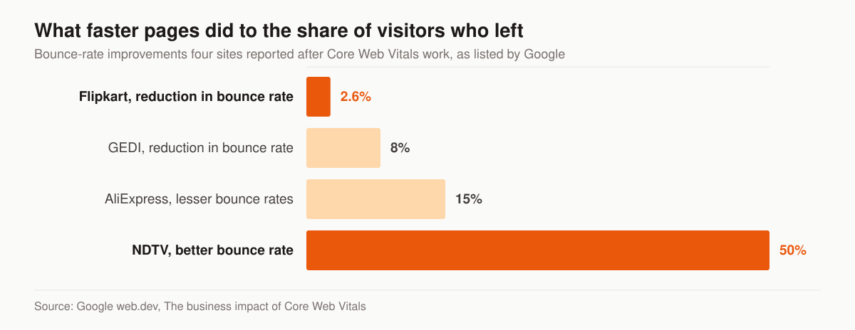
Reported bounce-rate improvement after Core Web Vitals work. Source: Google web.dev, The business impact of Core Web Vitals.
Read that chart for direction, not as a forecast. Every figure in it is self-reported by the company involved and collected by Google, none of the four sites is an insurance agency, and the NDTV number is described as coming after halving LCP “along with other product changes” — which means the speed work is not isolated from everything else that shipped. The same page lists two more results worth knowing: Agrofy Market’s “70% better LCP correlated to 76% reduction in load abandonment”, and Vodafone (Italy) improving LCP by 31% to achieve “8% more sales”. Google lists two key learnings against that Vodafone entry, and they are the honest lesson in the whole round-up: “A/B testing is the best way to measure the meaningful impact” and “A/B should be a server side one.” A before-and-after tells you what changed on your site; a test tells you what the change caused.
The form is where the page either works or does not
Everything above the form is a promise. The form is the transaction, and it is where agent sites give away the traffic they paid for.
The rule we build to is that a field earns its place only if the answer changes what happens next. On a callback offer, that is a name, a phone number and a ZIP. Age, mortgage balance, health questions and loan term all feel like qualification and all function as exits: each one is a fresh chance for a stranger on a phone to decide this is more work than they signed up for. Qualification is what the call is for. The form’s only job is to earn the call.
Three build details do more than the field count:
- Visible labels, not placeholders. Placeholder text disappears the moment someone types, which turns a three-field form into a memory test on a phone screen. It is also the failure the next section quantifies: over half of the home pages WebAIM scanned ship a form input with no label at all.
- The right keyboard. A phone field that opens a numeric keypad and a ZIP field that does the same remove two moments of friction that cost nothing to fix.
- One submit button, and nothing next to it. A second option beside the primary button — “or email us”, “or download the guide” — is not a helpful alternative. It is a fork in the road placed at the exact point you asked for a decision.
What the fine print under the button has to say
You are collecting a phone number in order to dial and text it, which means the consent language on the form is part of the design, not a legal afterthought bolted on at launch.
The FCC’s definition of prior express written consent at 47 CFR 64.1200(f)(9) governs autodialed and artificial-or-prerecorded marketing calls, not every call a producer places by hand — read the scope before you apply it. Where it does apply, the written agreement has to carry a clear and conspicuous disclosure, and one of the two things it must tell the signer is that “The person is not required to sign the agreement (directly or indirectly), or agree to enter into such an agreement as a condition of purchasing any property, goods, or services.”
For the page build, that has three consequences. The consent text belongs on the form itself, stored with the submission, rather than behind a link the visitor never opened. It cannot be bundled into the submit button, because the disclosure has to say that consenting is not the price of getting a quote. And the record you keep should tie the disclosure wording, the timestamp and the number together, so you can reproduce what the person actually saw. Our fuller treatment of consent capture and record-keeping sits in TCPA compliance for insurance agents buying leads. We provide marketing services, not legal advice — have your compliance counsel approve the wording before it ships.
Accessibility failures are conversion failures first
Agents hear “accessibility” and think lawsuit. Look at what actually breaks and it is the form, which means the cost lands on your lead count long before it lands anywhere else.
WebAIM’s annual scan of the top 1,000,000 home pages, run in February 2026, detected WCAG 2 A/AA failures on 95.9% of them, at an average of 56.1 errors per home page. The failure list is short and repetitive: low contrast text on 83.9% of home pages, missing image alternative text on 53.1%, and missing form input labels on 51% — over half the web shipping a form that a screen reader cannot describe, and that a sighted visitor loses the labels on as soon as they start typing.
Contrast is the other one worth fixing on a mortgage protection page specifically. Light grey helper text under a form field, a pale disclaimer, a CTA in a brand colour that scores badly against its background: each of those is read by a homeowner outdoors on a phone, in sunlight, at the exact moment you are asking for their number. Fixing contrast and labelling costs a few hours in the build and there is no version of the trade where it is not worth it.
The proof you are allowed to publish
Trust is the conversion bottleneck on this page type, which is precisely why it is the section people are tempted to invent. Since 21 October 2024 that temptation has had a federal rule attached to it.
The FTC’s Rule on the Use of Consumer Reviews and Testimonials, 16 CFR part 465, makes it “an unfair or deceptive act or practice and a violation of this part for a business to write, create, or sell a consumer review, consumer testimonial, or celebrity testimonial that materially misrepresents, expressly or by implication” that “the reviewer or testimonialist exists”, that they “used or otherwise had experience with the product, service, or business”, or “The reviewer’s or testimonialist’s experience with the product, service, or business that is the subject of the review or testimonial.” Four more sections of the same rule land on things an agent site can do without anyone deciding to:
- Paid-for sentiment. Section 465.4 covers a business that provides “compensation or other incentives in exchange for, or conditioned expressly or by implication on, the writing or creation of consumer reviews expressing a particular sentiment, whether positive or negative”. A gift card for a five-star review is inside that sentence; asking every client for an honest review is not.
- Reviews from your own side of the desk. Section 465.5(a) reaches an officer or manager writing a review or testimonial “that fails to have a clear and conspicuous disclosure of the officer’s or manager’s material relationship to the business, unless, in the case of a consumer testimonial, the relationship is otherwise clear to the audience.”
- Where the disclosure goes. The rule’s own definition of clear and conspicuous is specific about websites: “In any communication using an interactive electronic medium, such as social media or the internet, the disclosure must be unavoidable. A disclosure is not clear and conspicuous if a consumer must take any action, such as clicking on a hyperlink or hovering over an icon, to see it.” A disclosure parked on a separate terms page does not qualify.
- Filtered review widgets. Section 465.7(b) reaches a business that materially misrepresents that the reviews displayed on its site “represent most or all the reviews submitted to the website or platform when reviews are being suppressed (i.e., not displayable) based upon their ratings or their negative sentiment”, while carving out even-handed criteria applied to every review regardless of sentiment.
Note the knowledge element that runs through several of those provisions — the rule reaches a business that “knew or should have known” the review misrepresented something. Read the sections themselves before you rely on this summary, and route the question to counsel; we build pages, we do not give legal advice.
The practical build rule is easier than the regulation. Proof on a mortgage protection site should be things a stranger can verify without your help: your licence number, checkable against the state department of insurance lookup; a review count that matches what a visitor sees when they click through to the platform; a real photograph of the person who will make the call; the carriers you are actually appointed with. Where a slot needs proof you do not have yet, the honest build ships the slot empty. Our write-up of insurance agent website examples walks through what verifiable proof looks like in place.
Do not let the page look like it came from the lender
Mortgage protection has an image problem it did not entirely earn, and it comes from the mail. A homeowner who just closed is used to receiving envelopes that reference their lender’s name, their loan amount and their closing date, and that read like a notice rather than an offer. By the time that person reaches a website they are already scanning for whether this is a real agent or a look-alike.
So the page has to do the opposite of what the mailers do. Say the product is life insurance in the first paragraph and say it plainly. Name the agency and the licensed producer above the fold, not in the footer. State that the policy is optional and is not required by the lender or issued by them. Avoid layouts and wordmarks that borrow the visual grammar of a bank statement or a government notice. None of that costs conversion — it filters out the visitor who was going to feel tricked on the call, and it is the same reason the young-family mortgage protection audience responds better to a page that sounds like a person than to one that sounds like an institution.
What a mortgage protection website costs
Three published price shapes, and they are not competing for the same job.
This table lists live published prices we checked, alongside our own — read it as three different purchases rather than three quotes for the same thing.
| Option | Published price | What it suits |
|---|---|---|
| Insurance agency subscription platform | BrightFire lists Insurance Agency Websites at $170/month, no setup fee | A credible site quickly, when there is no traffic to convert yet |
| Mortgage-side template shop | Roar Solutions advertises mortgage websites from a $199 one-time setup fee plus $35/month | Presence on a budget; built for loan officers, not licensed insurance producers |
| One-time custom build with us | $2,500–$8,000 depending on scope | A site that has to carry paid traffic and its own conversion path |
| Managed program, site included | Foundation $2,500/month, Growth $3,500, Full-Funnel $5,500 | Ongoing SEO, content and — at Full-Funnel — managed paid ads and landing-page CRO |
Two notes on reading that table honestly. The Roar Solutions product is sold to mortgage brokers, agents and loan originators rather than to insurance producers, so it is a price benchmark rather than a like-for-like option. And a subscription platform is a rational choice, not a booby prize: if you have no traffic yet, a $170 monthly site that exists beats a $6,000 site that is still in wireframes. A build earns its cost at the point where the page has to survive paid traffic, carry its own comparison content and be measured against a competitor’s speed. The full breakdown of what each monthly tier contains is on the pricing page, and the underlying build discipline is the insurance web design service.
Schema, and what an AI assistant can quote from the page
Structured data on an agent site is worth doing and worth being realistic about.
Google narrowed FAQ rich results in August 2023: “Going forward, FAQ (from FAQPage structured data) rich results will only be shown for well-known, authoritative government and health websites. For all other sites, this rich result will no longer be shown regularly.” How-To rich results were limited to desktop in the same announcement. Google’s advice on the markup you already have is not to rip it out: “Structured data that’s not being used does not cause problems for Search, but also has no visible effects in Google Search.”
So do not budget for FAQ rich results on an agent site. Budget instead for the thing the markup still does, which is make the page trivially parseable — by Google’s own systems and by the assistants that increasingly answer “how does mortgage protection insurance work” before anyone reaches a search result. That means one clear answer directly under each question heading, in the page’s visible text rather than only in the JSON, plus organisation and producer details a machine can lift without guessing. The wider approach is our AI search and GEO service; the reason it belongs on a website page is that the same edits — short answers, plain nouns, real numbers, no marketing adjectives between the question and its answer — are what raise the form-fill rate for human readers too.
How to tell whether the site or the traffic is the problem
An agent looking at a flat month cannot usually say which half of the machine failed. The diagnosis is mechanical if you keep the four numbers separate.
Match your symptom to the left column; the fix on the right is where to spend the next two weeks.
| Symptom | Likely cause | What to change |
|---|---|---|
| Clicks arrive, form-fill rate under a few percent | Page-message mismatch with the ad | Rewrite the page headline to repeat the ad’s promise word for word |
| Form-fill rate fine, contact rate poor | Speed-to-lead, not the site | Automate the first text and dial; nothing on the page fixes this |
| Mobile converts far below desktop | Speed, layout shift or tap targets | Field data at p75, reserved image heights, thumb-sized controls |
| High traffic, no quality | Targeting or offer, not design | Change the ad’s qualifying language before touching the page |
| Nothing arrives at all | Traffic, not conversion | The site is not a traffic source; pair it with ads or search |
Two of those rows point away from the website entirely, which is the point of running the table before commissioning a redesign. A page converting well into a follow-up process nobody runs still produces no issued policies — which is why we judge the program on cost per issued policy rather than on form fills, the same standard the insurance landing pages service is built around.
The build order
Sequence matters, because two of these steps are worthless if they happen after launch instead of before it.
- Decide the one action. Callback, booked appointment or quote form. Everything else on the site is subordinate to it, and a site with two primary actions has none.
- Write the copy before the design. The layout is a container for an argument. Designing first produces a beautiful container looking for something to hold.
- Build the form and the consent language together. Retrofitting disclosure text into a finished form is how it ends up on a linked terms page, where the FTC’s own definition of clear and conspicuous says it does not count.
- Instrument before you launch. Call tracking, form-submission events, and a conversion event worth optimising on. Traffic sent to an uninstrumented page buys you a month of guessing.
- Test on a real phone on cellular. Not a desktop browser at a narrow width. The visitor is outdoors, on a mid-range Android, on a network you do not control.
- Measure at p75, not on your own device. Field data over lab data once real traffic arrives, because your device and your office wifi are the least representative test in the set.
- Change one thing at a time after launch. Headline, then form, then offer. A redesign that changes everything at once tells you the new page is different, not which part of it worked.
How this fits the rest of your marketing
A website is one component, not the whole machine. It sits downstream of your ads and upstream of your CRM. For the full picture, start at the mortgage protection marketing pillar and the global insurance web design service that powers these builds. The compliance side of the traffic that lands on it is covered in the mortgage protection Facebook ads guide. If you want our team to look at your current site and tell you exactly where it leaks, request a free marketing audit and we will mark up the page conversion-point by conversion-point, or talk to us directly about the build.
A site that books calls is not magic. It is a known structure, executed with the same discipline that runs a profitable lead book. Build that, and your ad dollars finally have somewhere to land.