Insurance Agency Website Examples: 9 Layouts and the Design Choices Behind Them
Strong insurance agent websites are built around one job per line of business: P&C sites lead with a quote form, life sites lead with trust and a booking calendar, Medicare sites lead with compliance, and commercial sites lead with proof. These nine layout archetypes show where the hero, proof, and call to action sit in each.
Search for insurance agent website examples and you mostly get screenshot galleries — twenty pretty homepages with no explanation of why any of them work. This page does the opposite. Below are nine layout archetypes, organized by line of business, with a teardown of where the hero, the proof, and the ask sit in each — plus a scoring table and a build checklist you can run against your own site.
Two facts frame everything that follows. Google’s Core Web Vitals guidance (web.dev, updated October 2024) says the largest element on your page should paint within 2.5 seconds for at least 75% of visits — slower than that and you’re losing visitors before layout even matters. And buyers arrive misinformed: LIMRA’s June 2025 Insurance Barometer release found healthy 18–30-year-olds “overestimated the median cost about 10–12 times more than its true cost” on a term life policy. A good agent website is engineered around both problems: fast enough to keep the visitor, and structured to correct what they arrived believing.
One honest note before the list: these are archetypes — recurring patterns from sites that convert — not real client sites. We’re not publishing anyone’s traffic data or dressing up screenshots as case studies. The value is the pattern, because a pattern is something you can apply to your own brand.
What makes a good insurance agent website?
A good insurance agent website matches its layout to how its product is bought: it puts one clear action above the fold, places licensing and proof beside the ask rather than in the footer, loads fast on a phone, and builds any required compliance language into the design instead of hiding it. Looks are secondary; the scoreboard is quotes started and calls booked.
Here’s that standard as a scorecard — score your current site before you read the examples, because the failing rows tell you which archetype you are closest to and where the leaks are.
| Criterion | Points | You pass if… |
|---|---|---|
| Offer matched to line | 15 | The headline names your product and buyer, not “welcome to our agency” |
| Above-the-fold action | 15 | A quote form, call button, or calendar is visible without scrolling on mobile |
| Quote UX fits the product | 12 | Price-shopped lines get a quote path; trust-bought lines get a booking path |
| Trust beside the ask | 12 | License number, carrier appointments, or a real face sits next to the form |
| Mobile speed | 10 | LCP under 2.5s on a phone, per Google’s Core Web Vitals thresholds |
| Compliance built in | 10 | Required disclaimers and consent language are designed in, not bolted on |
| Local proof | 8 | Reviews, map presence, or community signals for local-search visitors |
| Lead routing | 8 | Submissions hit your CRM and trigger follow-up, not an unwatched inbox |
| Post-submit next step | 5 | The thank-you page sets a callback window or offers a calendar slot |
| Answer-ready structure | 5 | Clean headings and direct answers that search and AI engines can extract |
Score 80+ and you’re arguing about polish. Under 60, the layout itself is the problem — and that’s a rebuild conversation, not a tweak. Rebuilding to this scorecard is exactly what our insurance web design service does.
9 insurance agent website examples, line by line
Each example below is a named pattern — what the hero leads with, where proof sits, what the call to action is, and which traffic it fits — so find your line in the table and then steal the structure underneath it.
| # | Archetype | Best for | Hero leads with | Primary CTA |
|---|---|---|---|---|
| 1 | Quote-first lander | Auto / home P&C | Short quote-start form | “Start my quote” |
| 2 | Trust-first advisor site | Term / whole life | Face, license, honest pricing context | “Book a call” |
| 3 | Compliance-forward site | Medicare | Plan-neutral help + TPMO disclaimer | “Schedule a review” |
| 4 | Click-to-call page | Final expense | One sentence + tap-to-call | “Call now” |
| 5 | Proof-first B2B site | Commercial lines | Industries served + service promises | “Request a review” |
| 6 | Hometown multi-line site | Local independent agency | Community identity + reviews | “Get a local quote” |
| 7 | Carrier-comparison site | Independent, any line | “We shop N carriers” positioning | “Compare my options” |
| 8 | Education hub | SEO / AI-referral traffic | A direct answer to the visitor’s question | Inline forms + sticky call |
| 9 | Dual-audience site | Agencies that recruit | Split paths: clients vs. agents | Two separate funnels |
1. The quote-first lander (P&C personal lines)
Auto and home buyers are price shoppers who already understand the product — the site’s only job is to not slow them down. The hero is a short quote-start form: ZIP, product, current-carrier question, contact fields last. Proof (carrier count, years local, review stars) sits in a thin strip beside or under the form, never above it. Navigation is minimal because every extra link is an exit. This layout fits paid search traffic, where the visitor typed “car insurance quote” eight seconds ago and will bounce to a carrier’s instant quoter if your page makes them hunt.
2. The trust-first advisor site (life insurance)
Life buyers arrive wrong about price and suspicious of hype — that LIMRA finding of a 10–12x cost overestimate is the design brief. Bryan Hodgens, head of LIMRA Research, put the skepticism plainly in the same release: “In a separate qualitative LIMRA study, even when young adults were presented with a true median cost of an insurance policy, some participants still doubted us.”
So the layout leads with credibility, not a form: a real face, license number and states, named carrier appointments, and honest pricing context (“premiums depend on age, health, and coverage — here’s a realistic range”) instead of teaser rates. The primary CTA is a booking calendar, because life sells through a conversation. We break this build down product-by-product in our guide to life insurance agent websites.
3. The compliance-forward site (Medicare)
Medicare sites are the one category where a legal block is part of the layout. Third-party marketing organizations must prominently display a CMS-prescribed disclaimer on their websites — the standard version begins, verbatim: “We do not offer every plan available in your area. Currently we represent [insert number of organizations] organizations which offer [insert number of plans] products in your area. Please contact Medicare.gov or 1-800-MEDICARE to get information on all of your options” (42 CFR §422.2267(e)(41)).
The archetype treats that as a feature: plan-neutral educational framing (“we help you compare, we don’t push one plan”), the disclaimer designed into the page where it reads as transparency rather than fine print, and a “schedule a review” CTA instead of hard-sell quote language. Forms stay light on health details. The full rulebook lives in our guide to CMS Medicare marketing rules for agents — but the design lesson is that on this line, visible compliance is a trust signal.
4. The click-to-call page (final expense and senior products)
Senior-market buyers would rather dial than type. The whole page fits one phone screen: a single sentence naming the product, state, and age band; a thumb-sized call button; the agent’s photo and license line directly beneath it; a short form as the fallback for non-callers. This is the highest-conviction archetype we run — we tore down five variants of it in our final expense agent website examples post, including the multi-step wizard and the local trust page.
5. The proof-first B2B site (commercial lines)
A business owner shopping commercial coverage isn’t price-shopping a widget — they’re vetting whether you can handle their risk and their paperwork. The hero names the industries you serve (“contractors, restaurants, trucking”), and proof does the selling: how fast you turn around a certificate of insurance, how renewals and claims get handled, which markets you can access. No instant-quote theater — commercial quoting runs through underwriters, and pretending otherwise reads as amateur. The form asks about the business (industry, employee count, current coverage), which filters tire-kickers and makes the follow-up call substantive. CTA: “request a coverage review” or “get a proposal.”
6. The hometown multi-line site (local independent agency)
This is the archetype for agencies whose traffic comes from local search and word of mouth. The hero leads with place and people — the town name, the storefront, the actual team — and a review strip pulled from the Google Business Profile sits before any product pitch. Each line of business gets its own focused page one click deep, so the auto shopper and the life prospect each land on a first screen built for them. The homepage’s job is routing and reassurance, not conversion; the line pages do the converting.
7. The carrier-comparison site (independent agency positioning)
Built around the one structural advantage an independent agent has over every captive competitor and every carrier: choice. The hero states it as a number — “we shop [N] carriers to find your fit” — with named carrier logos as proof and a comparison-framed CTA (“compare my options”). Body sections explain what independent means in plain terms, because most consumers genuinely don’t know. This archetype layers onto almost any line; it’s a positioning skin more than a full layout, and it works because it answers the visitor’s silent question: are you selling me one company’s product, or finding mine?
8. The education hub (search and AI-referral traffic)
Some agent sites win by answering questions before the visitor is ready to buy. The layout: each article opens with a direct answer to the query that brought the visitor, headings stay clean and extractable, an author box carries the agent’s license and market focus, and a short inline form or sticky call button repeats after each major section so the ask is always one scroll away. This is the slowest archetype to pay off and the most durable once it does — the mechanics of making it rank are covered in how to rank an insurance agency website on Google.
9. The dual-audience site (agencies that recruit)
Agencies and uplines recruiting producers face a layout problem nobody warns them about: recruiting copy repels clients, and client copy bores recruits. The archetype splits the site at the first screen — two clear paths (“get coverage” / “join our team”) with separate funnels, separate proof, and separate CTAs behind each. The common failure is letting recruiting take over the homepage, which quietly kills consumer conversion. If both audiences matter, both get a dedicated funnel; neither gets the homepage to itself.
How to build yours: a 10-step checklist
Archetypes are the map; this is the build order.
- Pick one line and one buyer to optimize first — the line you want to grow, not everything you’re licensed for.
- Choose the archetype from the table above that matches how that product is bought.
- Write the headline naming the product and the person: “auto insurance for [city] drivers” beats any welcome message.
- Place one action above the fold — quote form, calendar, or call button — and make it thumb-reachable on a phone.
- Stack the trust layer beside the ask: license number and states, carrier appointments, a real photo.
- Match the form to the product: short quote-start for price-shopped lines, booking for advice-sold lines, business questions for commercial.
- Do the compliance pass: TPMO disclaimer for Medicare, clear consent language at every form, qualifiers next to any claim.
- Do the speed pass: compress the hero image, cut autoplay video, and confirm LCP clears 2.5 seconds on a real phone.
- Wire the plumbing: submissions route to your CRM with an alert, and the thank-you page sets a callback window or books the slot.
- Score the finished page against the table at the top and fix any failing row before you send paid traffic to it.
Steps 1–4 are where most agent sites are already broken. If you only fix four things, fix those.
The honest platform note
Agents ask “WordPress or a website-in-a-box?” — but the platform matters less than the layout. A quote-first lander converts on almost any stack; a brochure homepage converts on none. That said, the trade-offs are real:
- Industry template builders are cheap and fast, and every competitor using them has the same site. Fine for a referral-only book; a ceiling once you pay for traffic, because you can’t restructure pages you don’t control.
- General page builders (WordPress and its cousins) give you full layout control at the cost of maintenance and — commonly — bloat. Most slow agent sites we see are heavy themes and stacked plugins, not the platform itself.
- Custom builds cost the most and are the only option where speed, layout, and compliance elements are engineered rather than approximated. The math works once traffic is paid: a one-point conversion lift on real ad spend repays the build.
Whatever the stack, the campaign-specific pages behind your ads deserve their own treatment — that’s a landing page discipline, distinct from the main site.
What these sites are built on, and what the platform charges
The galleries that rank for this query put a builder credit under each screenshot and stop there. Colorlib’s roundup tags its entries with a “Built with” line — Squarespace, WordPress, Webflow and “Custom” all appear in the same list — which tells you the stack and nothing about the bill. Two of the platforms behind those sites publish their prices, so here is what the credit actually costs. Both lists were read in September 2026.
Squarespace lists four plans: Basic at $19/mo, Core at $29/mo, Plus at $49/mo and Advanced at $99/mo. Those are the annual-billing figures — the page carries a “Pay annually / Pay monthly” toggle defaulted to annual, under a header reading “Free for 14 days. Pay annually to save up to 36%.”, so a month-to-month buyer pays more than these numbers. (Squarespace pricing). For an agent site the interesting boundary is not the price gap but where the feature list breaks. In the full comparison table, “Code injection”, “Code block (advanced)” and “Premium integrations and blocks” are marked “Not included” on Basic and “Included” from Core upward, and Basic caps contributors at 2. A rater embed, a call-tracking snippet and a CRM form script all sit on the far side of that line, so the $19 rung is a brochure rung by construction rather than by taste.
BrightFire, which sells to independent agencies, publishes a per-service ladder rather than tiers: Insurance Agency Website at $170/month, Reviews & Reputation Management at $110/month, Local Listings Management at $50/month, Social Media Marketing at $100/month, Search Engine Marketing at $160/month carrying the page’s own qualifier “Per campaign. Ad spend not included”, and an Ultimate SEO Bundle at $290/month against a struck-through $330 (BrightFire pricing). Its FAQ settles the setup-fee question in one line: “No. All of our services carry a monthly subscription cost that is charged at the time you enroll in a particular service.”
The third pattern is no number at all. Forge3, an insurance-specific website vendor, sends forge3.com/pricing to Agency Revolution’s consultation page, which asks for an email and a meeting slot and posts no price.
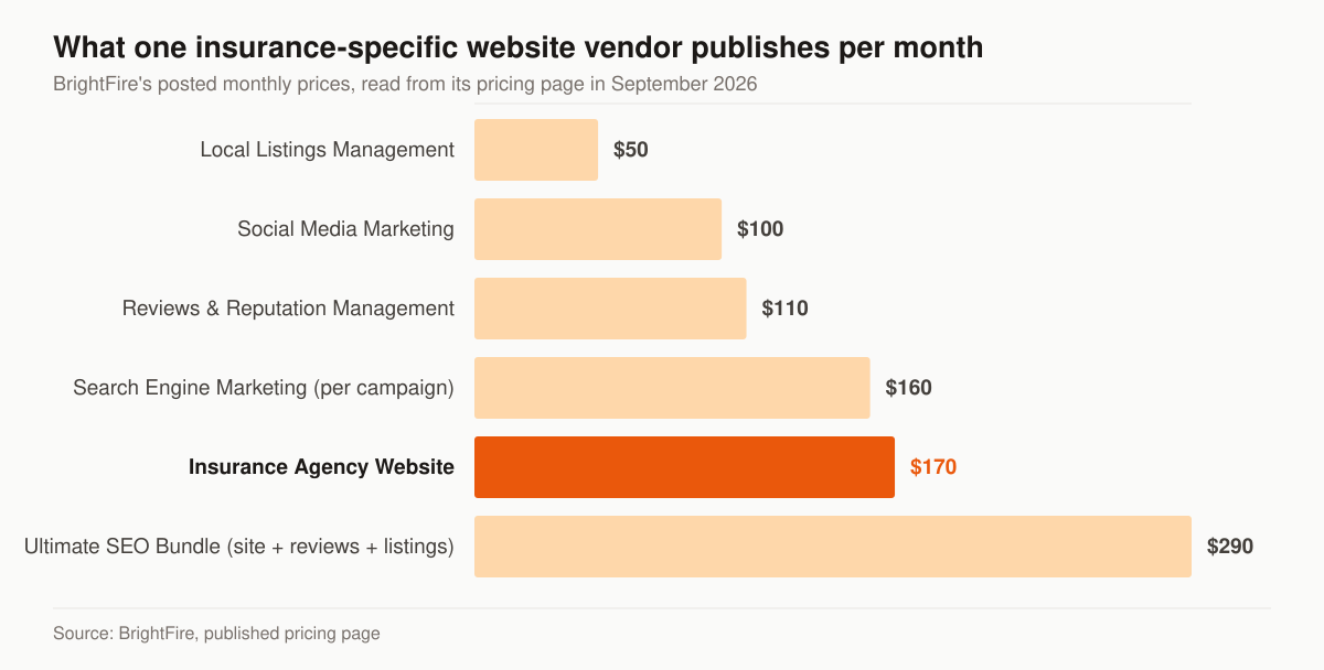
Chart: BrightFire’s published monthly prices, read from its pricing page in September 2026. The Search Engine Marketing row is priced per campaign and excludes ad spend; the bundle price is the discounted figure the page shows against a struck-through $330.
Read those as three different products wearing the same word, because what changes between them is not polish but how much of the page you are allowed to touch.
| What you’re buying | Published price | What you control | What you don’t |
|---|---|---|---|
| General site builder, self-served | Squarespace, $19/mo (Basic) to $99/mo (Advanced), billed annually | Layout, copy, pages, and from Core up, scripts | Code injection and premium blocks on Basic; nothing is insurance-specific |
| Insurance-specific vendor, subscription | BrightFire, $170/mo for the website | Your content inside the vendor’s system | The template, the stack, the roadmap |
| Insurance-specific vendor, quote-only | Not published (Forge3 routes to a consultation) | Unknown until the call | Unknown until the call |
| Custom build, one-time | Our website build, $2,500–$8,000 by scope | Structure, speed budget, compliance elements | Nothing you can’t change later |
Where our own numbers sit, so you can place them on the same ladder: the one-time website build is $2,500–$8,000 depending on scope, and the monthly programs that can run behind it are $2,500 Foundation, $3,500 Growth and $5,500 Full-Funnel, with ad spend billed at cost straight to the platforms — the full breakdown is on the pricing page. A subscription site and a managed program are not competing purchases. The first is the asset; the second is the traffic and follow-up that makes the asset earn.
One buying note the price lists make easy to miss. A monthly website subscription and a one-time build price the same object on different axes — rent versus ownership — and the axis that matters is what happens when you want to change the page. On a subscription, a layout change is a request in someone else’s queue. On a build you own, it is an edit. If you never intend to restructure the page, rent it. If the whole point of reading a page of layout archetypes is that you plan to restructure, factor that in before the monthly figure decides for you.
The accessibility layer the galleries don’t screenshot
Nothing in a screenshot tells you whether the quote form can be completed with a keyboard. The Justice Department’s guidance on web accessibility and the ADA, dated March 18, 2022, lists the barrier categories it cares about: poor color contrast, use of color alone to give information, lack of text alternatives on images, no captions on videos, inaccessible online forms, and mouse-only navigation (ADA.gov). Every one of those lives in a component the archetypes above depend on.
Two things about that guidance need stating precisely, because it gets quoted loosely. It sets no technical standard of its own: “The Department of Justice does not have a regulation setting out detailed standards, but the Department’s longstanding interpretation of the general nondiscrimination and effective communication provisions applies to web accessibility.” And the page carries its own limiter — guidance documents there “are not intended to be a final agency action, have no legally binding effect, and have no force or effect of law.” A banner adds that the page “does not reflect requirements for state and local governments that were published in the Federal Register on April 24, 2024”; that 2024 rule addresses Title II public entities, not a private agency’s marketing site. Whether your site is covered, and under what standard, is a question for your own counsel rather than for a design post.
Map the barrier list onto the components an agent site actually ships and the accessibility pass stops being an abstraction and becomes a punch list you can hand to a developer.
| Barrier in the DOJ list | Where it shows up on an agent site | The design fix |
|---|---|---|
| Inaccessible online forms | The quote-start form in archetype 1, the multi-step wizard behind archetype 4 | A visible label bound to each field, keyboard access, and an error message that names the problem and the fix |
| Poor color contrast | A pale call button over a hero photo; the TPMO disclaimer set in light gray | Contrast the text against the background it actually sits on, disclaimer included |
| Use of color alone to give information | Required fields marked in red and nothing else | Add the word “required” alongside the color, which is the example the guidance itself gives |
| Lack of text alternatives on images | Carrier logo strips, the agent’s photo, any chart | Short descriptive alt text carrying the purpose of the image |
| Mouse-only navigation | Sticky call bars, cookie banners and quote modals that answer only to a click | Reachable, operable and dismissible from the keyboard |
| No captions on videos | The agency intro video some heroes autoplay | Synchronized captions, or cut the video and win the speed pass instead |
The guidance’s line on tooling is the part to take literally. Automated checkers and overlays “can be helpful tools, but like other automated tools such as spelling or grammar checkers, they need to be used carefully,” and a clean report “does not necessarily mean everything is accessible.” Pairing an automated scan with a manual pass — tab through the form, submit it empty, read the error out loud — catches what the scan scores as green.
We treat the label-and-keyboard pass as part of building the form rather than as later remediation, because a real label, a sensible focus order and an error message that names the problem are the same work whether you file them under accessibility or under conversion. The wider set of rules that govern what an agent may publish — disclosures, testimonials, consent language — sits in our guide to insurance marketing compliance for agents.
Steal the pattern, not the pixels
Nine layouts, one rule underneath all of them: the site converts when its structure matches how the product is bought. P&C removes friction from a purchase the visitor already understands. Life and senior products manufacture trust before the ask. Medicare designs the rules into the page. Commercial proves competence. Pick your archetype, run the checklist, and score the result.
If you’d rather have an operator score it for you, request a free marketing audit — we’ll run your current site against this exact scorecard and show you which failing rows are actually costing you booked calls.
- Digital Marketing for Insurance Agents: The Channel-by-Channel Playbook
Digital marketing for insurance agents, channel by channel: which of SEO, PPC, social, email, and AI search to run first — by line and budget. Free audit.
- 40 Content Ideas for Final Expense Agents You Can Steal This Week
40 content ideas for final expense agents: cost and qualifying answers, video hooks, offline angles, and the capture step that turns views into leads.
- The Insurance Agency Marketing Plan That Fits on One Page
Build an insurance agency marketing plan in 7 steps: positioning, channels by line, quarterly budget, KPIs, compliance. Free fill-in one-page template.
- 45 Marketing Ideas for Insurance Agents, Ranked by Effort and Impact
45 marketing ideas for insurance agents, ranked into four tiers by effort and impact. Every idea notes the line it fits, from final expense to P&C.