Who we serve
Life Insurance Website Design Built Around the Quote Funnel
A life insurance agent website earns its keep in quote requests and booked appointments, not compliments. The build that works matches quote UX to product line — instant term quoting, call-back forms for final expense, calendar booking for IUL — and puts licensing, carrier appointments, and honest pricing context where a skeptical buyer can see them.
Free · 15-minute teardown · no pitch deck
- We run our own final-expense book
- No pitch deck — we screen-share real numbers
- TCPA-aware · CMS/AEP-compliant · Meta Special Ad Category
- Core Web Vitals < 2.0s LCP
The person landing on a life insurance agent’s website usually arrives wrong about the product — wrong about the price, and unsure who to trust with the question. LIMRA’s 2025 Insurance Barometer Study (June 2025) found healthy 18–30-year-olds “overestimated the median cost about 10–12 times more than its true cost” when asked to guess the premium on a $250,000 20-year term policy — and that the coverage need gap “still represents approximately 100 million Americans without adequate coverage.”
That misperception is the design brief. Life insurance agent websites don’t fail on aesthetics; they fail by ignoring what the visitor got wrong on arrival. A working site corrects the price story fast, proves you’re a licensed human rather than a lead reseller, and routes each product’s buyer into the quote path that fits how that product is actually sold. We build them with the same conversion discipline as our own senior-market lead operation — measured in appointments per hundred visitors, wired through our insurance web design service.
Why life insurance websites fail differently
Auto buyers comparison-shop a price they already roughly know. Life buyers are pricing their own mortality with a 10x-wrong number in their head — so the honest move is to address cost early instead of hiding it behind “contact us.”
Bryan Hodgens, senior vice president and Head of LIMRA Research, put it this way in the same study release: “The good news is that 54 million Gen Z and Millennial adults recognize their need for life insurance. Yet, there appears to be some ‘too good to be true’ thinking that complicates their purchase decisions.”
Both halves of that quote are website instructions. The recognized need means you don’t have to sell the category — you have to be the credible place to act on it. The “too good to be true” reflex means hype kills conversions: a site promising impossibly cheap coverage or guaranteed approval triggers the exact skepticism the buyer walked in with. Honest pricing context and visible credentials beat a louder pitch.
Match the quote UX to the product line
The single biggest structural mistake we see on agent sites: one generic contact form serving four different buyers. Each life product sells through a different motion, and the website has to mirror it.
Four product lines, four buyers, four quote paths — this is the mapping we build against.
| Product line | Who’s buying | Quote UX that converts | Primary CTA |
|---|---|---|---|
| Term life | Price-shopping 30s–50s, often mortgage-driven | Instant or indicative quote step, short health questions | “See your rate range” |
| Whole life / final expense | Seniors, phone-first, trust-driven | Short call-back form + click-to-call everywhere | “Get a call today” |
| IUL / cash-value | Retirement-minded, needs education | Calendar booking, no price on page | “Book a strategy call” |
| Mortgage protection | New homeowners responding to a trigger event | Form keyed to mortgage amount and close date | “Protect the payment” |
A term life buyer who can’t see a rate range bounces to a carrier’s instant quoter. A 72-year-old final-expense shopper handed a rate calculator calls whoever answers the phone instead — the layouts that respect that difference are dissected in our teardown of final expense agent website examples, and the wider set of layout archetypes for insurance agent websites shows how the same logic plays out across P&C, Medicare, and commercial lines. And an IUL page that quotes prices invites compliance problems while skipping the appointment where the product actually gets sold.
The pages a life insurance site needs, and the order to build them
A life site does not have to be large. It has to answer, on its own pages, the short sequence of questions a buyer works through: is this the right product, how much do I need, are you a real licensed person, and what happens if I act now. We build in that order rather than alphabetically, because a half-finished site with the first four pages live will take appointments and a complete site with none of them done will not.
Here is the page inventory we start a life build from, and the question each page has to close.
| Page | The question it closes | When we build it |
|---|---|---|
| One page per product line you write | Is this the right product for my situation? | First |
| A quote or booking path per product | What happens if I act right now? | First, wired to the UX in the table above |
| Licensing, states written, carrier appointments | Are you a licensed agent or a lead reseller? | First |
| Named producer bio with a photo | Who am I actually talking to? | First |
| Coverage-needs worksheet or calculator | How much coverage do I need? | Second |
| Term-versus-whole comparison | Which of these two am I choosing between? | Second |
| Service-area page | Do you write business where I live? | Second, and only where there is something local to say |
| Existing-policyholder page | I already own a policy — now what? | Third |
Two notes on that order. The service-area page sits in the second tier because a page that differs from its neighbour only by the city name is the pattern Google’s spam policies describe, which we work through in SEO for life insurance agents. And the existing-policyholder page arrives last but earns its slot: a beneficiary review is a conversation with somebody who already trusts you, which is a shorter road to a rewrite than a cold quote request from a stranger.
Product pages carry the ranking weight and quote paths carry the conversion, and the two are different templates doing different jobs. That split is why insurance landing pages get scoped separately from a site build — a landing page answers one ad’s promise and nothing else, while a product page has to satisfy a searcher who arrived with no context at all. The equivalent builds for the neighbouring product lines are laid out in final expense agent website design and IUL website design, and the whole life marketing page covers what changes when the product is permanent rather than term.
The trust layer life buyers check
Life insurance is a promise redeemed by someone else after you die — visitors audit the site for reasons to believe you’ll be there. Build the trust layer in this order:
- License number and states, in the header or footer of every page. It’s the one credential aggregators and lead resellers can’t display honestly, which makes it your cheapest differentiator.
- Carrier appointments, named. “We shop 15 A-rated carriers” with logos beats any adjective. It also answers the buyer’s silent question: are you selling me one company’s product or finding mine?
- A named agent with a face and a bio. Anonymous sites read as lead farms. The bio should say who you serve and how you’re paid, not list hobbies.
- Disclosures where the claims are. Simplified-issue and guaranteed-issue products invite “no exam, can’t be turned down” copy — keep it factual and put the qualifiers next to the promise, not in a footer nobody opens. We stay the marketing arm; you remain the licensed party making recommendations.
- Reviews with real names and situations. One review describing a paid claim or a smooth underwriting experience outworks ten five-star ratings with no story.
The quote form is a consent record, not just a lead capture
Every life quote form asks for a phone number, and the moment you dial or text that number with an autodialer or a prerecorded voice, federal telemarketing rules decide whether the form you designed was good enough. That makes it a layout problem, not a legal footnote — the consent sentence, the checkbox and the submit button all live inside the same two inches of screen, and where they sit changes both the conversion rate and the record you can produce later.
The governing definition sits in the FCC’s rules. 47 CFR 64.1200(f)(9) says prior express written consent means “an agreement, in writing, bearing the signature of the person called that clearly authorizes the seller to deliver or cause to be delivered to the person called advertisements or telemarketing messages using an automatic telephone dialing system or an artificial or prerecorded voice, and the telephone number to which the signatory authorizes such advertisements or telemarketing messages to be delivered.” Paragraph (a)(2) is the part that gives it teeth: it bars initiating “any telephone call that includes or introduces an advertisement or constitutes telemarketing, using an automatic telephone dialing system or an artificial or prerecorded voice” to the lines and numbers described in paragraphs (a)(1)(i) through (iii) — which include numbers assigned to cellular service — “other than a call made with the prior express written consent of the called party”, with narrow carve-outs for tax-exempt nonprofits and for health care messages from a HIPAA covered entity or its business associate.
Five form decisions map onto specific sentences in that rule, so they are worth reading side by side.
| Form decision | What the text says | Cite |
|---|---|---|
| The wording that lets you autodial or text the number | Consent must be an agreement in writing bearing the signature of the person called that “clearly authorizes the seller to deliver or cause to be delivered to the person called advertisements or telemarketing messages” using such equipment, and name “the telephone number to which the signatory authorizes” delivery | 64.1200(f)(9) |
| Whether the checkbox can be mandatory | The written agreement must clearly and conspicuously disclose that “The person is not required to sign the agreement (directly or indirectly), or agree to enter into such an agreement as a condition of purchasing any property, goods, or services.” | 64.1200(f)(9)(i)(B) |
| Whether a web checkbox counts as a signature | The term signature “shall include an electronic or digital form of signature, to the extent that such form of signature is recognized as a valid signature under applicable federal law or state contract law.” | 64.1200(f)(9)(ii) |
| Your STOP handling and the clock behind it | “All requests to revoke prior express consent or prior express written consent made in any reasonable manner must be honored within a reasonable time not to exceed ten business days from receipt of such request.” | 64.1200(a)(10) |
| The automatic reply your form fires | A one-time text confirming a revocation request does not violate paragraphs (a)(1) and (2) of the section “as long as the confirmation text merely confirms the text recipient’s revocation request and does not include any marketing or promotional information, and is the only additional message sent to the called party after receipt of the revocation request”. If it is sent within five minutes of receipt, “it will be presumed to fall within the consumer’s prior express consent.” | 64.1200(a)(12) |
One thing changed in 2025 that agents were told to rebuild their forms for and then were not. The FCC’s 2023 order would have required consent one seller at a time; on 24 January 2025 the Eleventh Circuit vacated that part of it in Insurance Marketing Coalition Limited v. Federal Communications Commission, No. 24-10277. The court held that the FCC “exceeded its statutory authority under the TCPA because the 2023 Order’s new consent restrictions impermissibly conflict with the ordinary statutory meaning of ‘prior express consent’”, stated plainly that “One-to-one consent is not required”, and closed with “PETITION GRANTED; ORDER VACATED IN PART AND REMANDED.” What remains in force is the older definition quoted above, which is what the current eCFR text shows. The design lesson is narrower than the headline: build the form around the elements the surviving rule actually names, and do not restructure a funnel around a rule that has been struck down.
Paragraph (a)(10) also settles an argument about opt-out wording. The rule treats “stop,” “quit,” “end,” “revoke,” “opt out,” “cancel,” or “unsubscribe” sent in reply to an incoming text as a reasonable means per se to revoke, and it bars callers and senders covered by paragraphs (a)(1) through (3) and (c)(2) from designating an exclusive means to request revocation of consent. If your follow-up stack only listens for one word in one system, that is a build defect rather than a vendor problem, and it belongs in the email and SMS automation wiring at launch. We stay the marketing arm here: your compliance counsel and your carrier’s advertising review sign off on the form copy. For the sibling rules that govern bought leads rather than your own form, see TCPA compliance for insurance agents buying leads; for the state advertising rules that treat the page itself as an advertisement, see insurance marketing compliance for agents.
Accessibility decides who can finish your quote form
A final-expense or whole life buyer in their late sixties may well be reading at 200% text zoom, using a screen reader, or navigating with a keyboard. On a life site, accessibility is not a compliance chore bolted on at the end — it is the difference between that visitor completing the call-back form and closing the tab.
The Department of Justice’s web guidance is short on prescription and clear on scope. It states that “The ADA requires that businesses open to the public provide full and equal enjoyment of their goods, services, facilities, privileges, advantages, or accommodations to people with disabilities”, and that “Title III prohibits discrimination against people with disabilities by businesses open to the public (also referred to as ‘public accommodations’ under the ADA).” On the technical side it says “The Department of Justice does not have a regulation setting out detailed standards, but the Department’s longstanding interpretation of the general nondiscrimination and effective communication provisions applies to web accessibility”, and then points somewhere specific: “Existing technical standards provide helpful guidance concerning how to ensure accessibility of website features. These include the Web Content Accessibility Guidelines (WCAG) and the Section 508 Standards, which the federal government uses for its own websites.”
That leaves WCAG as the working specification. Six of its success criteria cover what we check on a life quote funnel:
- 1.4.3 Contrast (Minimum) requires that “The visual presentation of text and images of text has a contrast ratio of at least 4.5:1”, with a 3:1 allowance for large-scale text and stated exceptions for incidental text and logotypes. Pale grey helper text under a form field is the usual casualty.
- 1.4.10 Reflow requires content to be presented “without requiring scrolling in two dimensions” at “a width equivalent to 320 CSS pixels”, with an exception: “Except for parts of the content which require two-dimensional layout for usage or meaning.” Its note names “data tables (not individual cells)” as an example. A four-column rate comparison can therefore sit inside the exception, but we treat a table that has to be dragged sideways on a phone as a conversion problem anyway, which is why rate tables get restructured for narrow screens rather than shrunk.
- 3.3.2 Labels or Instructions: “Labels or instructions are provided when content requires user input.” A placeholder that disappears the moment typing starts is not a label, and on a long health-question form it is how people lose their place.
- 3.3.1 Error Identification: “If an input error is automatically detected, the item that is in error is identified and the error is described to the user in text.” A red border describes nothing to a screen reader and very little to anyone else.
- 2.4.7 Focus Visible: “Any keyboard operable user interface has a mode of operation where the keyboard focus indicator is visible.” Deleting the focus ring for aesthetic reasons deletes the only cue a keyboard user has.
- 1.3.5 Identify Input Purpose asks that the purpose of a field collecting information about the user “can be programmatically determined”. In practice that is the autocomplete attribute on name, email and phone — which also lets a visitor with a saved browser profile fill those fields in one tap.
None of these are retrofits. Contrast ratios, focus states and field labels are settled in the design file, where they cost nothing, which is why they sit inside the insurance web design build rather than in a plugin bolted on after launch.
Lead magnets that fit a life buyer
The exchange rate on a life site is attention for usefulness. Three patterns consistently earn the email address:
- A coverage-needs worksheet — income, debts, years of support — because “how much do I need” is the question nearly every visitor arrived with.
- A term-versus-whole one-pager for the comparison shopper who isn’t ready to talk yet but will be in two weeks when the follow-up sequence lands.
- A beneficiary-review checklist aimed at existing policyholders — the quiet door into rewrites, coverage gaps, and referrals that most agent sites never build.
Every magnet feeds the same machine: capture, automated follow-up, booking link. A magnet without the follow-up sequence is a PDF giveaway, not lead generation — sourcing and working those leads is its own discipline, covered in our life insurance leads guide.
What a life insurance agent website costs
The vendors in this market publish their rates, which makes the comparison easy to do honestly. The three insurance-specific subscription platforms below publish rates between $89 and $310 a month, and their line items stack on top of each other.
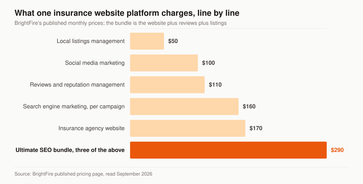
Source: BrightFire’s published pricing page, read September 2026. BrightFire lists an insurance agency website at $170 a month, reviews and reputation management at $110, local listings management at $50, social media marketing at $100, and search engine marketing at $160 a month per campaign with ad spend excluded. Its Ultimate SEO Bundle packages the website, reviews and listings at $290 a month, which the page describes as saving “$40/month off standalone prices” against the $330 those three carry separately. The same page answers the contract question directly: “We offer monthly and annual billing cycles, but you are never under contract and are free to cancel at any time.”
Here is where those published numbers sit next to ours.
| What you are buying | Published price | Source |
|---|---|---|
| Hosted template site, one plan | $89 a month, no setup fee, no contract | InsuranceSplash |
| Forge Essential platform site | From $140 a month plus $500 setup | Agency Revolution |
| Insurance agency website | $170 a month | BrightFire |
| Ultimate SEO bundle: site, reviews, listings | $290 a month | BrightFire |
| Forge Premium platform site | From $310 a month plus $1,000 setup | Agency Revolution |
| Our one-time website build | $2,500 to $8,000 depending on scope | Our published pricing |
| Our Foundation program, month to month | $2,500 a month | Our published pricing |
Read the last two rows against the first five and the gap is the point rather than something to explain away. Eighty-nine dollars a month buys a hosted template with the content written for you; InsuranceSplash publishes a three-day build and a cancel-anytime plan, and for an agent who needs a credible address on the internet that is a fair trade. Our Foundation tier is not a website at all — its published inclusions are the optimised site or landing pages, local SEO and Google Business Profile, on-page SEO and monthly reporting, with Growth adding the content engine, AI-search visibility and reputation work, and Full-Funnel adding managed paid ads, landing-page CRO and marketing automation. Two different products at two different prices.
The way to choose between them is arithmetic, not taste. Only you know your first-year commission on a term case and on a final-expense case, so put your own number into this sentence: this site has to produce N extra bound policies a year to pay for itself. If N comes out at one, the subscription platform is a bargain and you should stop reading. If your site is meant to carry paid traffic, absorb four product funnels and hold a consent record you can produce two years later, a template you cannot restructure becomes the ceiling on what all that traffic is worth.
Platform, template, or built: the questions that decide it
Three routes exist: a subscription platform built for insurance, a general website builder, and a site built for you. Price separates them on day one. What separates them in year three is what you own and what you are allowed to change.
Ask these six questions before you sign anything.
- Whose name is on the domain registration? The domain carries your rankings, your email and every link anyone ever built to you. It should be registered to you, at a registrar you can log into without asking permission.
- Can you export the content? Product pages you paid to have written are worth something on any platform. Pages you cannot export are rented, and the rent is the switching cost.
- Can you change the template? Every vendor above sells a template you customise. That is fine right up until the quote UX in the first table on this page collides with what the template permits — a final-expense call-back form and an instant term quoter are different layouts, and a one-layout site serves one of them well.
- How fast does an edit land, and what does leaving cost? BrightFire’s own FAQ says there are no setup fees, no per-user fees and no contract. Agency Revolution’s published prices carry a $500 setup on Forge Essential and $1,000 on Forge Premium, and it links a cancellation request form from its footer. Neither is a criticism; they are facts about friction, and friction is what you feel every time a carrier changes a product name.
- Who holds the reviews, the listing and the texting number? Those add-ons run $50 to $110 a month each on the published price lists, and they hold data. Confirm at the start whether the Google Business Profile and the texting number belong to you or to the vendor — our local SEO work assumes the profile is yours, because recovering one that is not is slow.
- Can the site carry the compliance layer? Disclosure text placed next to the claim it qualifies, a licensing block on every page, and a stored consent record are structural requirements, not content. A template that can only put disclosures in the footer is a template you will argue with.
Our answer is a built site, priced once at $2,500 to $8,000 with a program on top of it if you want one. That is the bias worth declaring on a page like this — and it is also why the arithmetic in the previous section matters more than our recommendation does.
What to measure once the site is live
A life site that cannot tell you which product path produced the appointment will get redesigned on the wrong screen. Four numbers settle those arguments, and all four are decided during the build rather than discovered afterwards.
- Visitor to quote request, per product path. Term, final expense and IUL get counted separately. One site-wide conversion rate averages away the path that is broken.
- Quote request to booked appointment. This belongs to the follow-up sequence rather than the website, and it is where a request you paid for goes quiet.
- Booked to held. A calendar link with no reminder sequence loses appointments that were already won, and a reminder sequence is a one-time build rather than an ongoing spend.
- Held to bound, by product. Tracing a bound policy back to the page that produced it is what lets you spend on the page that works instead of the page you like.
Instrumentation is unglamorous, and it is what turns a redesign opinion into a decision. Our insurance sales funnel work wires the site, the follow-up and the calendar so they report as one system rather than three dashboards nobody reconciles.
Built to be found, not just visited
The same LIMRA release reports that “nearly six in 10 young adults say they would use an AI tool to research a life insurance policy” — while 42% still prefer to buy from a financial professional in person. Read those together and the website’s job description writes itself: be citable where the research happens, and make booking the human easy when the buyer is done researching.
Practically, that means the site ships with clean structure, extractable answers on every product page, and the licensing and entity signals AI engines use to decide who’s credible — the same work that drives SEO for life insurance agents. A beautiful site nobody’s assistant ever cites is a brochure with a hosting bill.
Where this fits in the life marketing system
The website is the conversion layer of the life insurance marketing playbook — paid traffic, content, and referrals all land here, and the site’s quote paths decide what that traffic is worth. Built right, it’s also the one asset that keeps working when you pause ad spend.
Want to know what your current site is leaving on the table — visitor-to-appointment rate, where each product’s quote path leaks, which trust signal is missing? Request a free marketing audit and we’ll show you the funnel math the way an operator reads the books: numbers first, opinions second. If you already know what you want built and just need a number, the prices are published and you can tell us what you are working with.